How To Draw: Drawing and Sketching Objects and Environments from Your Imagination

How To Draw by Scott Robertson Review

How To Draw: Drawing and Sketching Objects and Environments from Your Imagination


My review of Scott Robertson’s book How to Draw: Drawing and Sketching Objects and Environments from Your Imagination.

Today I’m going to try a different format for this art book review. It’s going to be based on the “five Ws and one H”. Who, What, When, Where, Why, and How (but I am rearranging them to What, Who, Why, How, When, and Where).

What? Who? Why? How? When? Where?

What? What is this book about?

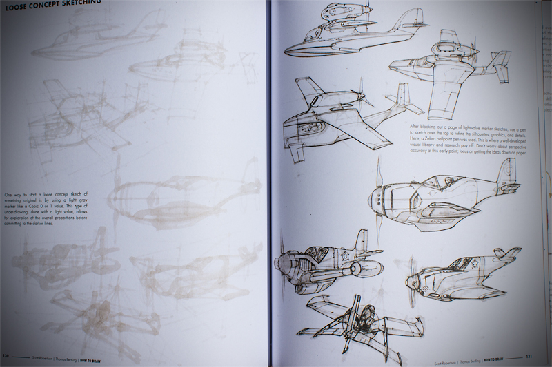
How to Draw: Drawing and Sketching Objects and Environments from Your Imagination is about perspective. It is essentially a roadmap, almanac, or bible of perspective. It is the designers best friend. Are you having trouble constructing perspective grids? This book is for you. Do you want to learn how to mirror objects in perspective? This book is for you. Do you wish you could draw airplanes but they are just so darn complex and intimidating? This book is for you.

Who? Who is Scott Robertson? Thomas who?

Would you still read an art book if the author was incompetent or had no experience in the art field? I know I wouldn’t. Scott Robertson is extremely competent and he has years of experience in the art/design world. Scott has authored nine Gnomon DVDs about rendering and designing. If you didn’t already know, The Gnomon Workshop is some of the top of the line art/design instruction in the world. Scott is the former chair of Entertainment Design at the Art Center College of Design. He has designed for Hot Wheels, theme parks, BMW, Mattel Toys, Rockstar Games, and Fiat. That sounds pretty knowledgable and competent to me. Scott Robertson technically co-authors the book with Thomas Bertling. Bertling is the Director of Entertainment Design at the Art Center College of Design. Bertling has worked with clients such as Disney and Samsung.

Why? Why is this book important?

Perspective is necessary for good drawing. That’s just a fact of life and if you ignore perspective, your work will suffer. Perspective matters! This book covers many aspects of perspective and design.

Scott_Robertson_1

Scott_Robertson_2


How? How does this book teach?

Scott and Thomas talk in an easy to understand language. Perspective is complex but they start from the foundation and work their way through the more complex aspects of perspective and design. Every lesson is broken down into smaller steps and each step is thoughtfully transcribed and illustrated. Throughout the book there are even links to videos by Scott Robertson to further explain a topic. The book starts by discussing drawing materials and some basic skills. Perspective terminology is covered next and then perspective drawing techniques. There’s a chapter dedicated to creating grids, and a chapter for ellipses and rotations. They cover working with volume, drawing environments, drawing aircraft, drawing wheeled vehicles, and finally sketching styles and mediums.

When? When should you add this book to your collection?

You should add How to Draw: Drawing and Sketching Objects and Environments from Your Imagination to your collection as soon as you can afford to purchase it. Paired with maybe one or two other perspective books and your perspective book collection will be complete.


Scott_Robertson_3

Scott_Robertson_4


Where? Where can you purchase this book?

You can purchase it on Amazon, here. It’s a remarkable value for the size of the book, the printing quality and the price. As of writing this review, the paperback edition is available on Amazon for only $25.27. This is the first book I’ve ever read from Design Studio Press and I am very impressed. It is over 200 pages long, it’s 9″ x 11″ and almost an inch thick. The paper stock is THICK. Every time I turned a page I thought there were pages stuck together because the paper stock is so nice. I look forward to more books from Design Studio Press.

 

Google Cultural Institute

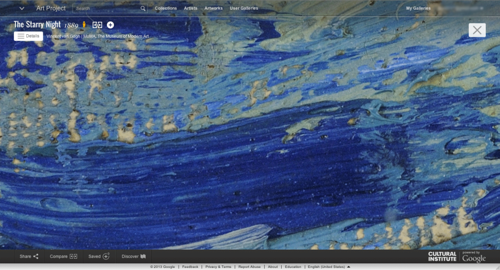
Van Gogh - The Starry Night Close Up

It has come to my attention that not many people know about Google Cultural Institute (formerly the Google Art Project, but now it includes much more). I love the Google Cultural Institute and you should too. Although I’d much rather see a Peter Paul Rubens (Not to be confused with Peter, Paul, and Mary) painting in person (I’ll add that to my non-existent bucket list), I don’t have the luxury of flying all over the world to see his paintings so Google Cultural Institute is my solution.

Fake disclaimer: Google Cultural Institute is a great website and you’re likely to lose track of time and browse artworks for hours. If you have deadlines or tasks to complete, wait to look at GCI until you have some free time.

Here’s a nifty video to introduce you to GCI:

The Google Art Project (part of the Google Cultural Institute) has hundreds thousands of artworks for you to view in high resolution. You can take a virtual tour through partnered museums, read about the artwork, browse other member’s “collections” of artwork (you can make your personal collection of artwork from the Google Art Project, write things about the pieces you chose, and share with the world), and so much more.

As always, if you click on an image in my posts you can usually see larger images.

Let’s take a quick tour through the Google Cultural Institute:

Here I am browsing the artwork of Peter Paul Rubens. You can scroll left and right to view more art work by Rubens. Notice the little blue “gigapixel” button next to the title of “Venus and Adonis”. There are several gigapixel images on the Google Art Project. You may ask yourself “what is a gigapixel?” You may ask yourself, where is that large automobile? Well you know how cameras have megapixels? Maybe your camera has 12 megapixels (That’s pretty standard). A gigapixel is 1,000 megapixels (Whaaaaat!!!).

Google Cultural Institute - Peter Paul Rubens

Browsing art work by Peter Paul Rubens in the Google Cultural Institute

Let’s take a look at the gigapixel image of “Venus and Adonis”:

Peter Paul Rubens - Venus and Adonis Description

You can get little history lessons about the art.

The descriptions are fun to read and they are very informative (unlike taking an actual art history class where you fall asleep and watch slides on a projector while the teacher drones on in a monotone voice). Enough of that, let’s zoom into the painting!

Peter Paul Rubens - Venus and Adonis Zoom 1

“You are such an Adonis!”

Peter Paul Rubens - Venus and Adonis Zoom 2

Look at the detail!

Peter Paul Rubens - Venus and Adonis Zoom 3

Pearls

Peter Paul Rubens - Venus and Adonis Zoom 4

If you are in an actual art museum and you can see a painting this closely, you need to back up a little before the security guard removes you from the premises.

There’s so much to look at with the Google Cultural Institute. A blog post can barely scratch the surface of how interesting GCI is. Go check it out for yourself! If you want a direct link to the Art Project, click here. And if you want to see the “Venus and Adonis” painting by Peter Paul Rubens, you can click here.

Looking Back On 2013

2013 Collage

2013 Highlights

2014 is here and I’m anxious to accomplish many things this year. It’s hard to believe that my blog has now been around for a year (Although technically the first post was on January 10, 2013). I somehow found something to talk about each month! When I first started my blog I had no idea how long it took to create a good post. Some posts take several hours to write, revise (and revise again many times), add photos, and much more. I certainly appreciate the work that blog writers put into their posts, now that I know how much effort is required to post meaningful content.

In this post we are looking back on 2013 at some highlighted posts.

The Monoprice tablet unboxing and review:

Some notable painting process posts:

Some art:

Art book reviews:

Miscellaneous:

I hope you have a happy new year and stick to your new year resolutions (unless your resolution is something awful like drowning 100 kittens; then I don’t hope you stick to your new year resolutions).

The Fantasy Artist’s Figure Drawing Bible Review

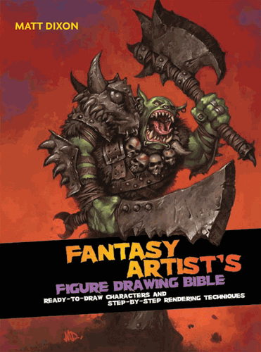
Fantasy Artists Figure Drawing Bible Cover

Fantasy Artist’s Figure Drawing Bible: Ready-to-Draw Characters and Step-by-Step Rendering Techniques

Let’s start off with an introduction of the author of The Fantasy Artist’s Figure Drawing Bible, Matt Dixon. How is Matt Dixon qualified to teach anyone about drawing fantasy figures? Well, he has produced art for various video game companies, including Sony Online Entertainment, and Blizzard Entertainment. I think he’s pretty qualified to teach young artists how to draw and paint. You can see his website here. You can see his blog here.

Here are some images of Matt Dixon’s work, taken from his website at mattdixon.co.uk:

Biker Girl

Source: mattdixon.co.uk

Master Marksman

Source: mattdixon.co.uk

Moon Reaver

Source: mattdixon.co.uk

Summer Rampage

Source: mattdixon.co.uk

Those paintings look pretty awesome, don’t they? Yes, yes they do. He seems pretty qualified to write a book about fantasy figure drawing, so let’s talk about the book.

At the time of this writing, The Fantasy Artist’s Figure Drawing Bible was $17.31 with free shipping (on orders over $35) on Amazon. That’s not too shabby for a book with 256 pages, albeit each page is only 5.75″ x 7.75″, so what normally might take up one page in a normal sized art book, could take up three pages in this book (that’s not an actual page rate, I’m just throwing out a estimate). The version of the book that I read is a spiral bound hardcover book. I don’t think I’ve ever read an art book that was spiral bound before this book (And I have read A LOT of art books). It’s not a bothersome format. The spiral bound format is nice because you can have the book open to any set of pages and not worry about having to weigh down one side of the book so the pages don’t fall back onto the other side (If you don’t know what I’m talking about, then try reading a book sometime by just laying it on the table).

The figure drawing bible was first published in 2008 by Barron’s Educational Series, Inc. (or Quarto Inc. I’m not sure if one of those companies is an imprint or not and the inside cover of the book doesn’t really tell me). The book begins with 2 pages that quickly describe how the book is laid out (and once you get to the character directory you will see that it’s the same several page layout for each character). Then there are 6 pages of fantasy artwork (one image per page) from artists such as Jonny Duddle, and Howard Lyon.

Next up is the “Getting Started” chapter, and in this section there are 10 pages total. The first section of the “Getting Started” chapter is 2 pages that list various artists and illustrators, as well as literature, movies, and places that can be of inspiration to the artist reading the book. After that, there are 4 pages that discuss tools and materials. The tools and materials section is very brief and is probably only helpful to the beginner artist. Dixon then compares a couple of techniques (Line vs tinted vs comic etc.), and then briefly talks about working digitally.

After the “Getting Started” chapter, we reach 34 pages about visual language. This chapter discusses things such as fantasy stereotypes, anatomy proportions, constructing the figure, composition, sketching, value, color, and rendering. The rendering section is my favorite part of the book, probably because I am already very familiar with the other rudimentary principles of art. It’s always nice to see an artist’s workflow and process.
Next up there is the “Character Directory”, which is the bulk of the book. In the character directory you are presented with a fantasy character or archetype. There is a full page illustration showing that character and the line art drawing if you wanted to trace or scan the drawing into your computer and try your hand at digital rendering. Dixon talks about the personality of the character, the design choices, developing the design and appearance of the character (including the face, body shape, weapons, etc.), constructing the character and posing them. Also included in each character section is a half page “Artist’s Tip” that can discuss anything from digitally painting skin tones to atmospheric perspective. The book uses the same format for each character, making it easy to digest. Some of the characters in the book include: imp, elf, dark elf, dwarf, mermaid, orc, troll, ogre, hero, etc.

Here are some images of the book, taken from Dickblick’s website:

hero

source: dickblick.com

sprite

source: dickblick.com

treeman

source: dickblick.com

I hope I helped you decide whether you want to purchase, rent, or skip this book. If you have any questions or comments, you can leave a comment or directly message me.

Monoprice Tablet Review

Monoprice Tablet Stock Photo

It’s time for my long-awaited Monoprice tablet review.

In January of 2013, I unboxed the Monoprice tablet and showed you the photos. I also included some size comparisons. I encourage you to check out the unboxing post so you can see the size comparisons and what comes with the drawing tablet. Anyways, I said that I would review it and I try to stick to my word, so here’s my Monoprice tablet review.


For the money ($56.61 as of the time of writing this review) you will be hard pressed to find a better drawing tablet. The tablet is similar to Wacom’s Intuos3 line of tablets (Not necessarily in that it looks similar to the Intuos3 tablets, but that it functions similarly). The Intuos3 tablets cost HUNDREDS of dollars. The price of the Monoprice tablet isn’t even a triple digit number.

Wacom has been running a monopoly in the digital drawing tablet market and it’s time for that to change.

Slowly, manufacturers (Monoprice, Huion, Hanvon, Yiynova etc.) are starting to break into the tablet scene and give Wacom some competition. Wacom is similar to Apple in the way that they both overcharge for what they are selling. People still buy their products regardless of the monumental prices because of the status and design.

If you were to gut a Cintiq (Wacom’s pen display) you would probably find parts that when totaled together, do not cost the outrageous prices that Wacom charges. There are people who use Wacom’s existing tablets and they make their own pen displays like the Cintiq but for a fraction of the price–further proof that Wacom overcharges you for sleek design. I know that this is capitalism and Wacom needs to profit so that they can pay their employees, create new products, and much more, but making a profit is one thing–ripping off your customers is another.

Wacom, like Apple, also release “new” products that are simply just slight revisions on past versions. For example, Wacom’s Intuos5 is essentially the same product as the Intuos4 but with touch capabilities (only some models have the touch capabilities). To me, that doesn’t seem like enough of a difference to warrant a number change from 4 to 5.

Now don’t get me wrong, I like Apple (I have several Apple products), and Wacom makes nice hardware (I someday hope to own a pen display like the Cintiq, if they lose their premium price) but I think that competition would be good for Wacom and that is why I chose to buy my drawing tablet from Monoprice. Competition between businesses is a good thing.

Another reason I decided to use a Monoprice tablet instead of a Wacom tablet is because I heard about a horrid thing called the “shoelace effect” affecting the newer Wacom Intuos tablets. You can learn more about that in this conceptart.org thread.


Here’s how I test my equipment:

Testing The Monoprice Tablet

Rigorously testing the Monoprice Graphics Tablet.

Now it’s time for the good, the bad, (the neutral) and the verdict:

PROS:

  • Inexpensive. The Monoprice tablet cost me about $56. Wacom wants hundreds of dollars for their products, although their newly revised (and re-named to Intuos) Bamboo tablet line is pretty impressive for the price.
  • Bang for the buck. The tablet performs very well and for the price, you are getting a great tablet.
  • Competition for Wacom. Wacom needs to be taken down a notch and some competition is healthy and good for the market. If Wacom suddenly feels threatened by the emergence of competitor’s tablets and pen displays, then they will improve their products (better hardware for less money) and value. The competition will then improve their products–rinse and repeat. This is good GREAT for the consumer. Maybe Wacom would stop releasing minor revisions as new tablets (see the intuos4 product line to the intuos5), and their products would be affordable.
  • Pen weight. The pen isn’t overly heavy or too light. It’s just personal preference to me. I don’t have experience with other tablet pens so I can’t comment on how it compares in weight/size.
  • Sturdy and affordable enough that you can throw it in your bag and not worry about it breaking. If it breaks you can just buy another one because it’s so affordable. Disclaimer: I wouldn’t encourage literally throwing it into your bag (or anywhere).
  • Slick surface. The nib on your pen doesn’t wear down as quickly as on a paper-like surface (see Intuos4 surface)
  • It’s not Wacom! 

NEUTRAL:

  • AAA battery pen. Although the pen requires 1 AAA battery, I haven’t had to change the battery yet since I bought the tablet. You will quickly forget it even requires a battery.
  • Hotkeys. I can’t say much about the hotkeys because I don’t use them.
  • Transparent flap thing. You can place drawings or photos underneath the transparent drawing surface (for tracing?). I have never used that feature. 

CONS:

  • Slick surface. Yes I know this was also a “pro”. Some people like drawing on slick surfaces (like the Intuos3) and some people don’t. I don’t really have an opinion on it, as I haven’t used the paper like surface of the Intuos4 and 5. I have a feeling that I would like a surface that’s not so slick. I know that a lot of people don’t like the paper-like surface of the Intuos4 and 5 because it wears the nibs/tips down quickly. Of course you can buy replacement tips for Wacom’s products but they charge you MUCH more than what the tips should cost. (By the way, if you have a Wacom tablet and you need to replace your nibs, just make your own)
  • Pen requires a AAA battery. This isn’t really a big deal but a “con” nonetheless. Remember, I still haven’t had to replace the battery yet. Also, AAA batteries aren’t expensive.
  • No eraser. There is no eraser on the rear of the pen. It doesn’t bother me. I just switch between the brush and eraser in Photoshop by clicking ‘b’ and ‘e’. Many of my Wacom-using-friends tell me that they don’t even use the eraser feature on the Wacom pens (Maybe I could count this as a “neutral” instead of a “con”).
  • Cheap rubber grip on pen. The rubber grip around the pen slides if you have a tight grip. I might be too stressed and it’s hard for me to relax so maybe that’s just a problem with me (if you want to help me relax, I accept technology, art supply and monetary donations).
  • Nib wear. The nib can sharpen into a chisel. I don’t have enough experience with Wacom tablets to know if they do that too.
  • Not wireless. I don’t really mind that it’s wired (the cord is long enough for me) but it would be a definite plus if the tablet was wireless.
  • Some slow almost 45 degree strokes will jitter. This may be the software I’m using, the operating system I have, the way I draw, the digitizer in the tablet, or many other things. I’m not sure if it’s the tablets fault. There are too many variables to narrow down what causes it. Most people don’t seem to notice.

Let’s take a look at the specs:

  • Overall dimensions: 14.5” x 12” (I think it’s closer to 14” x 11”).
  • Active drawing area: 10” x 6.25”.
  • Pen is about 6.25” long and at it’s thickest spot it’s almost ½” thick.
  • The cord is about 56” long
  • Resolution (LPI): 4000
  • Report Rate Speed (RPS): 200
  • Pressure Sensitivity: 1024 levels
  • It also comes with some software that’s probably horrible, and you probably wouldn’t ever use it anyways. I don’t even know if it’s mac compatible software.

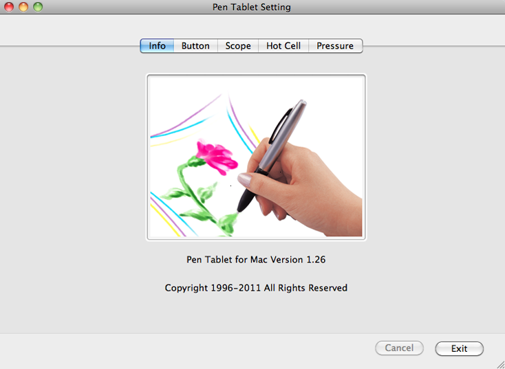
Let’s take a look at the settings you can change in the driver for the tablet.

Monoprice Pen Tablet Settings Info

They could have probably used a better picture for the “info” screen in the tablet settings.

Monoprice Pen Tablet Settings Buttons

You can assign different things to the buttons the pen. I don’t even use the two buttons on the pen.

Monoprice Pen Tablet Settings Scope

Here you can change the active drawing area of the tablet. You can make the active area smaller so that your brush strokes will be longer and smoother. I think I’ll probably change my settings soon. It’s kind of annoying having to move my whole hand when I need to reach the far corner of the screen.

Monoprice Pen Tablet Settings Hot Keys

You can assign different programs or commands to the hotkeys or “hot cells” as they call them. I unassigned all of the hotkeys so I wouldn’t accidentally open the web browser or paste something. Even if you left all of the hotkeys as they were, you would probably have no trouble keeping your pen away from them. I did it JUST IN CASE.

Monoprice Pen Tablet Settings Pressure

Here you can adjust how hard or soft you need to press the pen.

If the Huion H610 existed before I purchased the Monoprice tablet I may have purchased the H610 instead. I’m happy with my purchase and I don’t regret choosing the Monoprice tablet. I’ll probably buy the H610 some day and see if I like it more than the Monoprice tablet. The Monoprice tablet is a bit too large for my tastes. With digital painting it’s easiest to draw from the wrist. Smooth curving lines and stiff straight lines are difficult to paint/draw on a tablet. Having a smaller active area to draw on makes it easier to achieve smooth curving lines and stiff straight lines. After you install the drivers for the Monoprice tablet you can adjust the active area on the tablet. I never tried to change it. A smaller tablet would also take up less space and that’s always a bonus.


VERDICT: BUY THIS TABLET (on Amazon because after shipping from Monoprice it’s more expensive).

For less than $60 the Monoprice tablet is a great value and good competition for Wacom. If you don’t want to spend hundreds of dollars on a tablet, or you want to buy a tablet that isn’t made by Wacom, then this tablet is a solid choice.

Drawing and Painting Fantasy Figures Review

Drawing_and_Painting_Fantasy_Figures_Cover

Drawing and Painting Fantasy Figures: From the Imagination to the Page

Here’s my quick review of Drawing and Painting Fantasy Figures by Finlay Cowan. I wrote this review a couple of months ago and forgot to post it. Don’t buy this book unless you have no idea that wizards are in the fantasy genre, or if you want to learn how to draw badly. I don’t have any personal grudges against Finlay Cowan (he has good ideas and his design work is nice but he definitely isn’t known for his draughtsmanship) but wow, this book is bad (Although it’s not so bad that it should be burned–it’s just a bad art book in my opinion). Most of the drawings seem amateurish (or maybe all of the twelve-year-olds that I see draw are trying to copy his style), and unless somebody can draw well, I don’t think they should teach anyone else how to draw. The 3d modeled images in this book are terrible. However, I have to remind myself that this book was published in 2003 (so the 3d modeling obviously won’t hold up to the 2013 3d standards).

I have to give Finlay Cowan kudos for including so many topics in one book (perspective, anatomy, painting, storyboarding etc.), but the reader would be better off if they learned perspective, anatomy, painting, and storyboarding from other books dedicated to those subjects.

One of the only things I found interesting in this book were the designs that Finlay Cowan drew for Pink Floyd album art (seen below).

Finlay_Cowan_Pink_Floyd

Image from Amazon.com

If you really want this book, you can buy the book here. I don’t understand how, but at the time of writing this review, Drawing and Painting Fantasy Figures has an average 3.8 rating (out of 5 stars) on Amazon. Maybe the reviewers are much younger than me. Maybe they can’t draw very well or haven’t read very many art books. Whatever the case, some people enjoyed this book so you might too (though I hope you have higher standards for art books than those reviewers on Amazon).

Still Life Painting Atelier Review

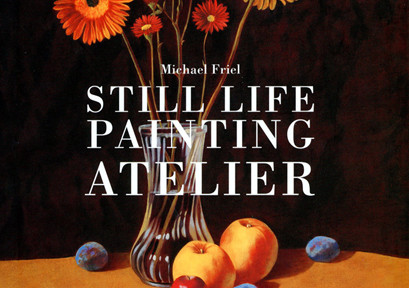
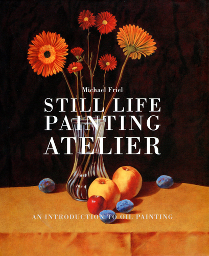
This post is my review of Still Life Painting Atelier: An Introduction to Oil Painting by Michael Friel.

Still Life Painting Atelier Michael Friel

In my last post, I reviewed Jane Jone’s book Classic Still Life Painting. Today I’m reviewing Michael Friel’s book Still Life Painting Atelier. His book covers topics such as studio safety, lighting your still life, stretching paper, and several painting demonstrations that show how he uses limited color palettes, scumbling, glazing, and more.

Michael’s book has over 20 pages of information about painting materials (brushes, paints, oils, varnishes, supports, etc.). He discusses how someone can arrange objects and set up a still life. Michael talks about how he paints reflections and translucent surfaces (something very intimidating to beginners). He demonstrates an alla prima (wet into wet) still life painting, in addition to a still life painting executed by painting a grisaille (a monochromatic underpainting) followed by transparent glazes of color.

A lot of the information in this book is rudimentary, but for a beginner, the information is necessary. For someone that’s new to oil painting, the breadth of information covered in this book is enough to inspire and set the wheels in motion for their artistic development. Compared to Classic Still Life Painting by Jane Jones (see that review here), I think Still Life Painting Atelier is a better book for the beginning oil painters.

If you’re an artist that likes to paint with watercolor and now you’re looking to try oil painting, I think you might may want to first read Jane Jone’s book Classic Still Life Painting, and then read Still Life Painting Atelier once you decide you want to try some different approaches to painting. Although I think Still Life Painting Atelier is a better book for the beginning oil painters, Classic Still Life Painting focuses on the technique of glazing oil paint (the oil paint equivalent of watercolor washes), which should be more familiar to the watercolorist. By all means, read Still Life Painting Atelier and Classic Still Life Painting.

Classic Still Life Painting Review

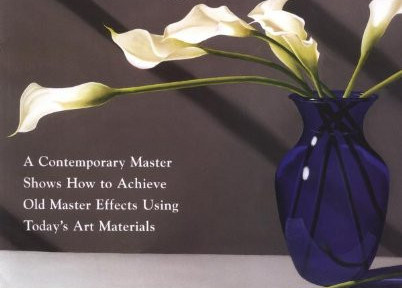
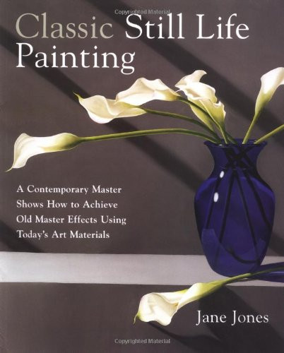
This post is my review of Classic Still Life Painting: A Contemporary Master Shows How to Achieve Old Master Effects Using Today’s Art Materials by Jane Jones.

I recently read two different still life painting books because I have been in the mood to paint some still life paintings. I did some research online and ended up reading Classic Still Life Painting, and Still Life Painting Atelier. Watson-Guptill publishes both books (it seems like almost every book I read is published by Watson-Guptill).

Classic Still Life Painting Jane JonesClassic Still Life Painting is focused on painting still lifes with transparent glazes of oil paint. Painting with transparent glazes (a la watercolor) creates luminosity not possible through strictly opaque application of paint because of the way light bounces through the paint (perhaps I’ll do a blog post about that). She covers five pages of materials for painting and then jumps right into some color theory and color palettes, also differentiating paints that are transparent and those that are opaque. Jane has some helpful tips on creating your own color charts (color charts/color notes are helpful formulas of color mixtures that the artist references to accurately re-mix paint if needed). Throughout the book, Jane shows her color notes/charts and it might seem overwhelming for the beginning oil painter. Don’t worry so much about the color mixtures that she mixes from her smorgasbord of oil paints, and instead focus on the technique she is using to paint.

She talks about preparing a support (the surface that receives the paint), blending, using an alkyd such as Liquin, and lighting a still life. Jane primarily photographs her still life setups and paints from many different photos of the scene. She discusses some tips for photographing a still life.

Jane talks about accurately drawing and perspective in the next chapter, as well as the steps she takes to draw her demo still life. She then paints an underpainting and begins glazing many layers of paint. She shows another painting using the same methods but with slightly different elements. This continues for the rest of the book until the end where she talks about varnishing.

Something that bothered me about the book Classic Still Life Painting, is that Jane naggingly reminds the reader that they should use alkyd medium in each subsequent layer on the painting. Sure, she could mention that once, but the reader might miss it and it’s kind of important. I suppose a couple reminders are okay, but she makes a point to slip that “helpful hint” into the text so many times that it started to drive me nuts. I get it! I should use Liquin in every layer! OKAY! Additionally, after the first couple demos, the book seems a bit repetitive and I lost my interest (but that doesn’t mean you will lose interest!).

Overall, I think Classic Still Life Painting is a nice book and it can certainly be of value to beginning oil painters, watercolorists transitioning to oil painting, and artists who want to try a classical technique to paint still lifes.

Stay tuned for my next still life book review blog post where I review Still Life Painting Atelier by Michael Friel.

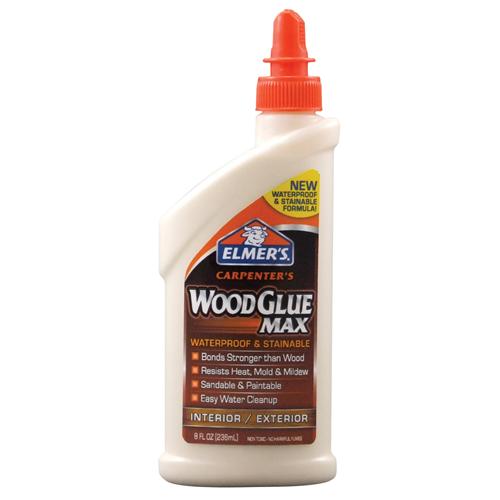
Elmer's Carpenter's Wood Glue Max

Elmer’s Carpenter’s Wood Glue Max Strength Test

Elmer's Carpenter's Wood Glue Max

Because I need strong wood glue to keep a painting attached to the wood braces.

Lately I have been doing a lot of prep work for future paintings. I also am looking into wood bracing (often referred to as cradling) for two finished paintings (which, now that I think about it, aren’t even on my website yet). After searching through dozens of threads on WetCanvas and AMIEN, I still wasn’t exactly sure what type of glue to use to attach the bracing to the back of the paintings but I knew that I wanted the bracing to be strong. After reading about some strength tests with several types of glues, I made a not-so-quick trip to Lowe’s and I purchased Elmer’s Carpenter’s Wood Glue Max (they also offer a non “max” wood glue). For the test I used 3/16″ hardboard (often mistakenly referred to as Masonite) and 1″ x 2″ select pine wood for the bracing. I used the Wood Glue Max to glue the select pine to the hardboard. The glue was allowed to dry for 24 hours (although this test was actually done several days after gluing).

Here’s a video of my testing the strength of the glue:

As you can see, the glue held a strong bond and the wood broke instead of the glue. I will definitely be using this wood glue in the future, and no, I’m not being paid by Elmer’s to praise their product.


Casein Painting by Henry Gasser

Casein Painting: Methods and Demonstrations Review

Casein Painting Cover

Casein Painting: Methods and Demonstrations Review

What is casein paint? According to Wikipedia (teachers just love it when you cite Wikipedia), casein paint is a fast-drying and water-soluble paint made from milk casein (casein is a type of protein [eating casein paint will not make you stronger]). Casein paint has been used for a long time. When casein paint thoroughly dries it becomes water resistant (like acrylic paint). Casein paint is a fairly versatile medium. It can be used like watercolor or gouache, and dries to a nice velvet-like matte finish. When dry (and isolated using a varnish), casein paint can be used as an underpainting for oils. According to Casein Painting: Methods and Demonstrations, casein paint “provides an excellent stepping stone for the watercolorist who wants to do oil painting, and for the oil painter who may have hesitated in the past to attempt watercolor.” I was first introduced to casein paint in a Stephen Quiller book (maybe I’ll review it some day). If that’s not enough of an introduction to casein paint for you, feel free to check out this thread on the WetCanvas forum.

Now that we all know what casein paint is, we can move along to the review. The book is Casein Painting: Methods and Demonstrations by Henry Gasser. This book had its first print in 1950 (before computers, cars, fire, and language [basically the ice age]). You can buy it on Amazon.

Henry Gasser covers the materials used when painting with casein paint (brushes, palettes, surfaces), casein paint as watercolor, using casein paint opaquely like gouache, painting with casein paint on gesso panels, making an underpainting with casein, mounting paper, etc. If you want to know more about those things you should read the book.

Henry uses the following palette:

cadmium yellow lightCadmium Yellow Light

Cadmium Orange

Cadmium Red Light

Alizarin Crimson

French Ultramarine Blue

Phthalocyanine Blue

Phthalocyanine Green

Yellow Ochre

Raw Sienna

Burnt Sienna

Indian Red

Burnt Umber

Ivory Black

Titanium White

Chromium Oxide Green

Davy’s Gray

The paper in Casein Painting: Methods and Demonstrations has a nice gloss but tears easily when turning from page to page (the book is old so perhaps in its prime the pages didn’t tear so easily). There are a total of 7 color reproductions in this book. I wish all of the images were printed in color but I understand that the publisher saved money by printing it mostly in black and white. Casein Painting is a fairly short book, being only 67 pages long (or short), but had the author decided to bulk up the book by including frivolous information, then the book would be too long. The 67 page length seems just about right for Casein Painting.

I think that this book is a good introduction to casein paint and provides practical examples of how to use casein paint. If you collect art instruction books, this may be a nice addition to your collection (just remember to be careful when turning the pages). As of this review, Casein Painting can be purchased on Amazon for $15.20.

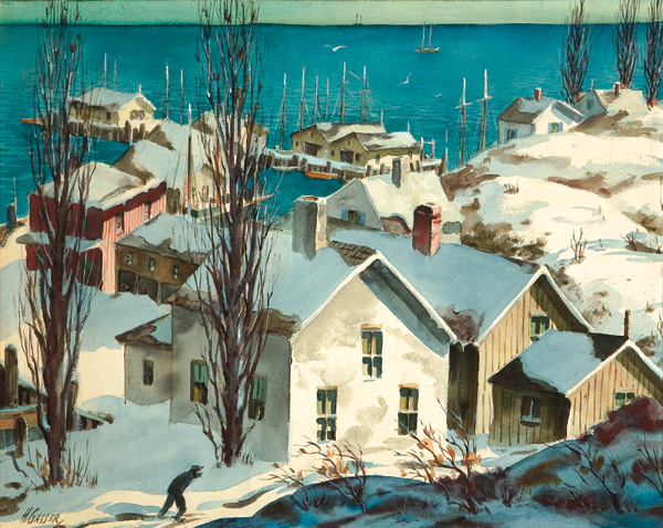
Here’s a taste of what Henry Gasser’s paintings looked like:
New England Winter Casein Painting by Henry Gasser