How To Draw: Drawing and Sketching Objects and Environments from Your Imagination

How To Draw by Scott Robertson Review

How To Draw: Drawing and Sketching Objects and Environments from Your Imagination


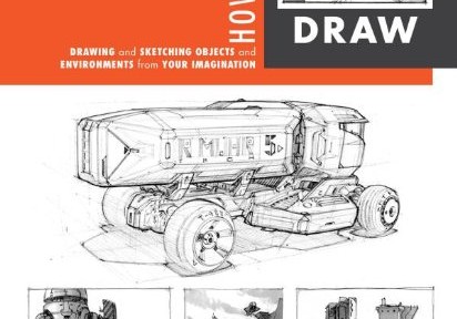
My review of Scott Robertson’s book How to Draw: Drawing and Sketching Objects and Environments from Your Imagination.

Today I’m going to try a different format for this art book review. It’s going to be based on the “five Ws and one H”. Who, What, When, Where, Why, and How (but I am rearranging them to What, Who, Why, How, When, and Where).

What? Who? Why? How? When? Where?

What? What is this book about?

How to Draw: Drawing and Sketching Objects and Environments from Your Imagination is about perspective. It is essentially a roadmap, almanac, or bible of perspective. It is the designers best friend. Are you having trouble constructing perspective grids? This book is for you. Do you want to learn how to mirror objects in perspective? This book is for you. Do you wish you could draw airplanes but they are just so darn complex and intimidating? This book is for you.

Who? Who is Scott Robertson? Thomas who?

Would you still read an art book if the author was incompetent or had no experience in the art field? I know I wouldn’t. Scott Robertson is extremely competent and he has years of experience in the art/design world. Scott has authored nine Gnomon DVDs about rendering and designing. If you didn’t already know, The Gnomon Workshop is some of the top of the line art/design instruction in the world. Scott is the former chair of Entertainment Design at the Art Center College of Design. He has designed for Hot Wheels, theme parks, BMW, Mattel Toys, Rockstar Games, and Fiat. That sounds pretty knowledgable and competent to me. Scott Robertson technically co-authors the book with Thomas Bertling. Bertling is the Director of Entertainment Design at the Art Center College of Design. Bertling has worked with clients such as Disney and Samsung.

Why? Why is this book important?

Perspective is necessary for good drawing. That’s just a fact of life and if you ignore perspective, your work will suffer. Perspective matters! This book covers many aspects of perspective and design.

Scott_Robertson_1

Scott_Robertson_2


How? How does this book teach?

Scott and Thomas talk in an easy to understand language. Perspective is complex but they start from the foundation and work their way through the more complex aspects of perspective and design. Every lesson is broken down into smaller steps and each step is thoughtfully transcribed and illustrated. Throughout the book there are even links to videos by Scott Robertson to further explain a topic. The book starts by discussing drawing materials and some basic skills. Perspective terminology is covered next and then perspective drawing techniques. There’s a chapter dedicated to creating grids, and a chapter for ellipses and rotations. They cover working with volume, drawing environments, drawing aircraft, drawing wheeled vehicles, and finally sketching styles and mediums.

When? When should you add this book to your collection?

You should add How to Draw: Drawing and Sketching Objects and Environments from Your Imagination to your collection as soon as you can afford to purchase it. Paired with maybe one or two other perspective books and your perspective book collection will be complete.


Scott_Robertson_3

Scott_Robertson_4


Where? Where can you purchase this book?

You can purchase it on Amazon, here. It’s a remarkable value for the size of the book, the printing quality and the price. As of writing this review, the paperback edition is available on Amazon for only $25.27. This is the first book I’ve ever read from Design Studio Press and I am very impressed. It is over 200 pages long, it’s 9″ x 11″ and almost an inch thick. The paper stock is THICK. Every time I turned a page I thought there were pages stuck together because the paper stock is so nice. I look forward to more books from Design Studio Press.


DIY Graphite Transfer Paper

4_Alcohol

Learn how to inexpensively make graphite transfer paper!

If you are looking for an inexpensive way to transfer a drawing to your board or canvas then I recommend you make some DIY graphite transfer paper! Using a projector to transfer your drawings is very easy too but you have to spend hundreds of dollars on a nice projector (unless you are printing on transparencies and using an old overhead projector) and then you have to make sure the room is dark enough for you to see the projection and you have to line everything up and it can be a hassle. If you scan your drawing (which you should do anyways to add to your digital archive of artwork), and enlarge it, shrink it, do whatever you have to do, and print it out at the exact size of your painting, you can use graphite transfer paper to trace your drawing onto your final surface. Another interesting transfer method is using a printed copy from a laser printer and transferring the image using acrylic medium. I’ll post more about that method later.

What’s the point in buying graphite transfer paper if you can quickly and easily make it yourself? I’m always trying to save money when I can, and making some DIY graphite transfer paper is one way to save a little bit of cash. I should mention that sometimes “saving money” by doing something yourself actually can cost you more money in the end by taking up lots of your time. Time=money. Making your own graphite transfer paper is quick and easy though so you aren’t spending much time on this.

1_Materials

Here I have all of my materials ready. Clockwise from top left: my printed drawing at full size, my original drawing just for reference (not sure why I kept it in the photo), tracing paper, and the illustration board (already ruled and marked for bleed and with a border).


2_Tape

This step is optional but it helps to line up your drawing to your already marked borders on the final surface. I laid the tracing paper over my illustration board and, using the guides on the board, I place painters tape along the edges of the tracing paper. Also in the photo is some isopropyl alcohol, a tissue, a 6B graphite stick, and some cardboard.


3_Graphite

I rubbed the graphite stick onto the tracing paper.


4_Alcohol

I set a piece of cardboard underneath the tracing paper so nothing would happen to the table (not sure if anything would happen but it doesn’t hurt to be cautious). I put a little bit of the isopropyl alcohol onto the tissue and gently wiped the graphite cover surface of the tracing paper. After that dried I carefully removed the tape. Please have adequate ventilation when using the isopropyl alcohol. It can make it hard to breathe and cause other problems.


5_Paper_Over_Board

I flipped my DIY graphite transfer paper over and placed it in the correct spot on top of my illustration board.


6_Taped_Drawing

I taped my printout onto the transfer paper.


7_Tracing

I traced along the lines of my printout using a ballpoint pen. You can use a sharp pencil, or some sort of stylus too.


8_DoneThe final transfer! It’s done! Now it’s time refine some things on the drawing and then paint.

If you have other interesting ways to transfer images to your final substrates, I’d love to hear them!

Looking Back On 2013

2013 Collage

2013 Highlights

2014 is here and I’m anxious to accomplish many things this year. It’s hard to believe that my blog has now been around for a year (Although technically the first post was on January 10, 2013). I somehow found something to talk about each month! When I first started my blog I had no idea how long it took to create a good post. Some posts take several hours to write, revise (and revise again many times), add photos, and much more. I certainly appreciate the work that blog writers put into their posts, now that I know how much effort is required to post meaningful content.

In this post we are looking back on 2013 at some highlighted posts.

The Monoprice tablet unboxing and review:

Some notable painting process posts:

Some art:

Art book reviews:

Miscellaneous:

I hope you have a happy new year and stick to your new year resolutions (unless your resolution is something awful like drowning 100 kittens; then I don’t hope you stick to your new year resolutions).

The Fantasy Artist’s Figure Drawing Bible Review

Fantasy Artists Figure Drawing Bible Cover

Fantasy Artist’s Figure Drawing Bible: Ready-to-Draw Characters and Step-by-Step Rendering Techniques

Let’s start off with an introduction of the author of The Fantasy Artist’s Figure Drawing Bible, Matt Dixon. How is Matt Dixon qualified to teach anyone about drawing fantasy figures? Well, he has produced art for various video game companies, including Sony Online Entertainment, and Blizzard Entertainment. I think he’s pretty qualified to teach young artists how to draw and paint. You can see his website here. You can see his blog here.

Here are some images of Matt Dixon’s work, taken from his website at mattdixon.co.uk:

Biker Girl

Source: mattdixon.co.uk

Master Marksman

Source: mattdixon.co.uk

Moon Reaver

Source: mattdixon.co.uk

Summer Rampage

Source: mattdixon.co.uk

Those paintings look pretty awesome, don’t they? Yes, yes they do. He seems pretty qualified to write a book about fantasy figure drawing, so let’s talk about the book.

At the time of this writing, The Fantasy Artist’s Figure Drawing Bible was $17.31 with free shipping (on orders over $35) on Amazon. That’s not too shabby for a book with 256 pages, albeit each page is only 5.75″ x 7.75″, so what normally might take up one page in a normal sized art book, could take up three pages in this book (that’s not an actual page rate, I’m just throwing out a estimate). The version of the book that I read is a spiral bound hardcover book. I don’t think I’ve ever read an art book that was spiral bound before this book (And I have read A LOT of art books). It’s not a bothersome format. The spiral bound format is nice because you can have the book open to any set of pages and not worry about having to weigh down one side of the book so the pages don’t fall back onto the other side (If you don’t know what I’m talking about, then try reading a book sometime by just laying it on the table).

The figure drawing bible was first published in 2008 by Barron’s Educational Series, Inc. (or Quarto Inc. I’m not sure if one of those companies is an imprint or not and the inside cover of the book doesn’t really tell me). The book begins with 2 pages that quickly describe how the book is laid out (and once you get to the character directory you will see that it’s the same several page layout for each character). Then there are 6 pages of fantasy artwork (one image per page) from artists such as Jonny Duddle, and Howard Lyon.

Next up is the “Getting Started” chapter, and in this section there are 10 pages total. The first section of the “Getting Started” chapter is 2 pages that list various artists and illustrators, as well as literature, movies, and places that can be of inspiration to the artist reading the book. After that, there are 4 pages that discuss tools and materials. The tools and materials section is very brief and is probably only helpful to the beginner artist. Dixon then compares a couple of techniques (Line vs tinted vs comic etc.), and then briefly talks about working digitally.

After the “Getting Started” chapter, we reach 34 pages about visual language. This chapter discusses things such as fantasy stereotypes, anatomy proportions, constructing the figure, composition, sketching, value, color, and rendering. The rendering section is my favorite part of the book, probably because I am already very familiar with the other rudimentary principles of art. It’s always nice to see an artist’s workflow and process.

Next up there is the “Character Directory”, which is the bulk of the book. In the character directory you are presented with a fantasy character or archetype. There is a full page illustration showing that character and the line art drawing if you wanted to trace or scan the drawing into your computer and try your hand at digital rendering. Dixon talks about the personality of the character, the design choices, developing the design and appearance of the character (including the face, body shape, weapons, etc.), constructing the character and posing them. Also included in each character section is a half page “Artist’s Tip” that can discuss anything from digitally painting skin tones to atmospheric perspective. The book uses the same format for each character, making it easy to digest. Some of the characters in the book include: imp, elf, dark elf, dwarf, mermaid, orc, troll, ogre, hero, etc.

Here are some images of the book, taken from Dickblick’s website:

hero

source: dickblick.com

sprite

source: dickblick.com

treeman

source: dickblick.com

I hope I helped you decide whether you want to purchase, rent, or skip this book. If you have any questions or comments, you can leave a comment or directly message me.

Drawing and Painting Fantasy Figures Review

Drawing_and_Painting_Fantasy_Figures_Cover

Drawing and Painting Fantasy Figures: From the Imagination to the Page

Here’s my quick review of Drawing and Painting Fantasy Figures by Finlay Cowan. I wrote this review a couple of months ago and forgot to post it. Don’t buy this book unless you have no idea that wizards are in the fantasy genre, or if you want to learn how to draw badly. I don’t have any personal grudges against Finlay Cowan (he has good ideas and his design work is nice but he definitely isn’t known for his draughtsmanship) but wow, this book is bad (Although it’s not so bad that it should be burned–it’s just a bad art book in my opinion). Most of the drawings seem amateurish (or maybe all of the twelve-year-olds that I see draw are trying to copy his style), and unless somebody can draw well, I don’t think they should teach anyone else how to draw. The 3d modeled images in this book are terrible. However, I have to remind myself that this book was published in 2003 (so the 3d modeling obviously won’t hold up to the 2013 3d standards).

I have to give Finlay Cowan kudos for including so many topics in one book (perspective, anatomy, painting, storyboarding etc.), but the reader would be better off if they learned perspective, anatomy, painting, and storyboarding from other books dedicated to those subjects.

One of the only things I found interesting in this book were the designs that Finlay Cowan drew for Pink Floyd album art (seen below).

Finlay_Cowan_Pink_Floyd

Image from Amazon.com

If you really want this book, you can buy the book here. I don’t understand how, but at the time of writing this review, Drawing and Painting Fantasy Figures has an average 3.8 rating (out of 5 stars) on Amazon. Maybe the reviewers are much younger than me. Maybe they can’t draw very well or haven’t read very many art books. Whatever the case, some people enjoyed this book so you might too (though I hope you have higher standards for art books than those reviewers on Amazon).

Still Life Painting Atelier Review

This post is my review of Still Life Painting Atelier: An Introduction to Oil Painting by Michael Friel.

Still Life Painting Atelier Michael Friel

In my last post, I reviewed Jane Jone’s book Classic Still Life Painting. Today I’m reviewing Michael Friel’s book Still Life Painting Atelier. His book covers topics such as studio safety, lighting your still life, stretching paper, and several painting demonstrations that show how he uses limited color palettes, scumbling, glazing, and more.

Michael’s book has over 20 pages of information about painting materials (brushes, paints, oils, varnishes, supports, etc.). He discusses how someone can arrange objects and set up a still life. Michael talks about how he paints reflections and translucent surfaces (something very intimidating to beginners). He demonstrates an alla prima (wet into wet) still life painting, in addition to a still life painting executed by painting a grisaille (a monochromatic underpainting) followed by transparent glazes of color.

A lot of the information in this book is rudimentary, but for a beginner, the information is necessary. For someone that’s new to oil painting, the breadth of information covered in this book is enough to inspire and set the wheels in motion for their artistic development. Compared to Classic Still Life Painting by Jane Jones (see that review here), I think Still Life Painting Atelier is a better book for the beginning oil painters.

If you’re an artist that likes to paint with watercolor and now you’re looking to try oil painting, I think you might may want to first read Jane Jone’s book Classic Still Life Painting, and then read Still Life Painting Atelier once you decide you want to try some different approaches to painting. Although I think Still Life Painting Atelier is a better book for the beginning oil painters, Classic Still Life Painting focuses on the technique of glazing oil paint (the oil paint equivalent of watercolor washes), which should be more familiar to the watercolorist. By all means, read Still Life Painting Atelier and Classic Still Life Painting.

Classic Still Life Painting Review

This post is my review of Classic Still Life Painting: A Contemporary Master Shows How to Achieve Old Master Effects Using Today’s Art Materials by Jane Jones.

I recently read two different still life painting books because I have been in the mood to paint some still life paintings. I did some research online and ended up reading Classic Still Life Painting, and Still Life Painting Atelier. Watson-Guptill publishes both books (it seems like almost every book I read is published by Watson-Guptill).

Classic Still Life Painting Jane JonesClassic Still Life Painting is focused on painting still lifes with transparent glazes of oil paint. Painting with transparent glazes (a la watercolor) creates luminosity not possible through strictly opaque application of paint because of the way light bounces through the paint (perhaps I’ll do a blog post about that). She covers five pages of materials for painting and then jumps right into some color theory and color palettes, also differentiating paints that are transparent and those that are opaque. Jane has some helpful tips on creating your own color charts (color charts/color notes are helpful formulas of color mixtures that the artist references to accurately re-mix paint if needed). Throughout the book, Jane shows her color notes/charts and it might seem overwhelming for the beginning oil painter. Don’t worry so much about the color mixtures that she mixes from her smorgasbord of oil paints, and instead focus on the technique she is using to paint.

She talks about preparing a support (the surface that receives the paint), blending, using an alkyd such as Liquin, and lighting a still life. Jane primarily photographs her still life setups and paints from many different photos of the scene. She discusses some tips for photographing a still life.

Jane talks about accurately drawing and perspective in the next chapter, as well as the steps she takes to draw her demo still life. She then paints an underpainting and begins glazing many layers of paint. She shows another painting using the same methods but with slightly different elements. This continues for the rest of the book until the end where she talks about varnishing.

Something that bothered me about the book Classic Still Life Painting, is that Jane naggingly reminds the reader that they should use alkyd medium in each subsequent layer on the painting. Sure, she could mention that once, but the reader might miss it and it’s kind of important. I suppose a couple reminders are okay, but she makes a point to slip that “helpful hint” into the text so many times that it started to drive me nuts. I get it! I should use Liquin in every layer! OKAY! Additionally, after the first couple demos, the book seems a bit repetitive and I lost my interest (but that doesn’t mean you will lose interest!).

Overall, I think Classic Still Life Painting is a nice book and it can certainly be of value to beginning oil painters, watercolorists transitioning to oil painting, and artists who want to try a classical technique to paint still lifes.

Stay tuned for my next still life book review blog post where I review Still Life Painting Atelier by Michael Friel.

Casein Painting by Henry Gasser

Casein Painting: Methods and Demonstrations Review

Casein Painting Cover

Casein Painting: Methods and Demonstrations Review

What is casein paint? According to Wikipedia (teachers just love it when you cite Wikipedia), casein paint is a fast-drying and water-soluble paint made from milk casein (casein is a type of protein [eating casein paint will not make you stronger]). Casein paint has been used for a long time. When casein paint thoroughly dries it becomes water resistant (like acrylic paint). Casein paint is a fairly versatile medium. It can be used like watercolor or gouache, and dries to a nice velvet-like matte finish. When dry (and isolated using a varnish), casein paint can be used as an underpainting for oils. According to Casein Painting: Methods and Demonstrations, casein paint “provides an excellent stepping stone for the watercolorist who wants to do oil painting, and for the oil painter who may have hesitated in the past to attempt watercolor.” I was first introduced to casein paint in a Stephen Quiller book (maybe I’ll review it some day). If that’s not enough of an introduction to casein paint for you, feel free to check out this thread on the WetCanvas forum.

Now that we all know what casein paint is, we can move along to the review. The book is Casein Painting: Methods and Demonstrations by Henry Gasser. This book had its first print in 1950 (before computers, cars, fire, and language [basically the ice age]). You can buy it on Amazon.

Henry Gasser covers the materials used when painting with casein paint (brushes, palettes, surfaces), casein paint as watercolor, using casein paint opaquely like gouache, painting with casein paint on gesso panels, making an underpainting with casein, mounting paper, etc. If you want to know more about those things you should read the book.

Henry uses the following palette:

cadmium yellow lightCadmium Yellow Light

Cadmium Orange

Cadmium Red Light

Alizarin Crimson

French Ultramarine Blue

Phthalocyanine Blue

Phthalocyanine Green

Yellow Ochre

Raw Sienna

Burnt Sienna

Indian Red

Burnt Umber

Ivory Black

Titanium White

Chromium Oxide Green

Davy’s Gray

The paper in Casein Painting: Methods and Demonstrations has a nice gloss but tears easily when turning from page to page (the book is old so perhaps in its prime the pages didn’t tear so easily). There are a total of 7 color reproductions in this book. I wish all of the images were printed in color but I understand that the publisher saved money by printing it mostly in black and white. Casein Painting is a fairly short book, being only 67 pages long (or short), but had the author decided to bulk up the book by including frivolous information, then the book would be too long. The 67 page length seems just about right for Casein Painting.

I think that this book is a good introduction to casein paint and provides practical examples of how to use casein paint. If you collect art instruction books, this may be a nice addition to your collection (just remember to be careful when turning the pages). As of this review, Casein Painting can be purchased on Amazon for $15.20.

Here’s a taste of what Henry Gasser’s paintings looked like:
New England Winter Casein Painting by Henry Gasser

colored pencil painting bible front

Colored Pencil Painting Bible Review

My Colored Pencil Painting Bible review.

colored pencil painting bible review

The book that I’m reviewing today is Colored Pencil Painting Bible: Techniques for Achieving Luminous Color and Ultra-realistic Effects by Alyona Nickelsen. The first thing that I noticed about the book was the cover (duh). That’s a pretty great colored pencil drawing (or painting as the author calls them). The basic technique used throughout the book is essentially layering color with wax based colored pencils (Prismacolor pencils), using solvent (such as Gamblin’s OMS Gamsol) to remove visible pencil strokes and blend the colors together, and finally layering more colored pencil (burnishing where needed) to complete the “painting”.

In the Colored Pencil Painting Bible, Alyona talks about different types of paper, pencils, solvents, and other things such as erasing tools. She tells the reader about color charts and how the reader can create them. This book briefly covers art fundamentals such as composition, color, value, light, and shadows. The author also talks about different pencil strokes, blending, layering colors, burnishing, and image transferring.

At the end of the Colored Pencil Painting Bible the author includes charts that list the lightfastness (how permanent or unaffected by light the color is) of colored pencils. The information can be useful to artists who use colored pencils such as Caran d’Ache Luminance, or Faber-Castell Polychromos. The majority of artists that I know (including myself) who use colored pencils prefer Prismacolor Premier pencils. The charts have no lightfastness ratings for those pencils, which was a huge letdown for me. Thankfully for you, I took the initiative to find the lightfast ratings for the Prismacolor Premier colored pencils. You can see that chart here.

One nice tip I took away from this book is how to obtain a rich black color. Alyona applies black colored pencil to the paper (she prefers Stonehenge), and melts the wax with an OMS wash. Next, she layers indigo blue, dark green, and tuscan red. She then adds another layer of black and blends the mix with a colorless blender.

While I think that Alyona’s technique is nice, I think that the book could be shorter and have a smaller price tag (although as I write this review the book is only $17.15 on Amazon). I think that it has too many exercises in it that just bulk it up. This book provides a good foundation for anyone interested in furthering their knowledge of colored pencils, or anyone who is interested in taking colored pencil art seriously. I recommend at least checking it out from the library if you are serious about colored pencil art.

There you have it! That’s my Colored Pencil Painting Bible review.