DIY Graphite Transfer Paper

4_Alcohol

Learn how to inexpensively make graphite transfer paper!

If you are looking for an inexpensive way to transfer a drawing to your board or canvas then I recommend you make some DIY graphite transfer paper! Using a projector to transfer your drawings is very easy too but you have to spend hundreds of dollars on a nice projector (unless you are printing on transparencies and using an old overhead projector) and then you have to make sure the room is dark enough for you to see the projection and you have to line everything up and it can be a hassle. If you scan your drawing (which you should do anyways to add to your digital archive of artwork), and enlarge it, shrink it, do whatever you have to do, and print it out at the exact size of your painting, you can use graphite transfer paper to trace your drawing onto your final surface. Another interesting transfer method is using a printed copy from a laser printer and transferring the image using acrylic medium. I’ll post more about that method later.

What’s the point in buying graphite transfer paper if you can quickly and easily make it yourself? I’m always trying to save money when I can, and making some DIY graphite transfer paper is one way to save a little bit of cash. I should mention that sometimes “saving money” by doing something yourself actually can cost you more money in the end by taking up lots of your time. Time=money. Making your own graphite transfer paper is quick and easy though so you aren’t spending much time on this.

1_Materials

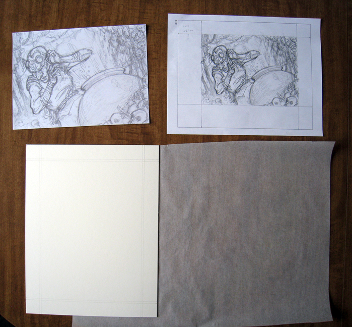
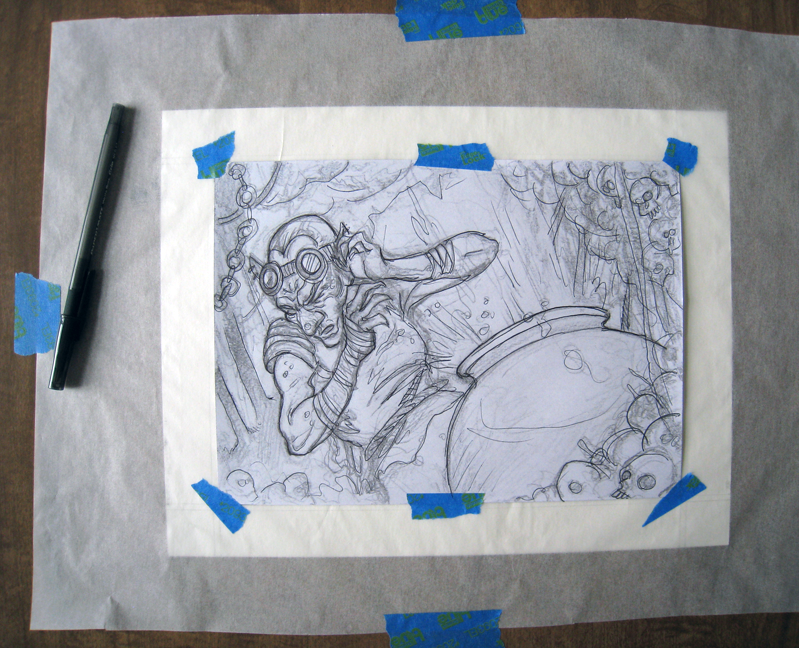
Here I have all of my materials ready. Clockwise from top left: my printed drawing at full size, my original drawing just for reference (not sure why I kept it in the photo), tracing paper, and the illustration board (already ruled and marked for bleed and with a border).


2_Tape

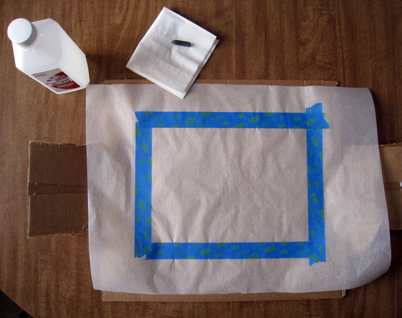
This step is optional but it helps to line up your drawing to your already marked borders on the final surface. I laid the tracing paper over my illustration board and, using the guides on the board, I place painters tape along the edges of the tracing paper. Also in the photo is some isopropyl alcohol, a tissue, a 6B graphite stick, and some cardboard.


3_Graphite

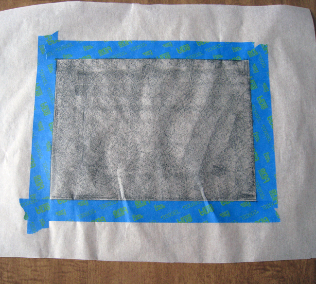
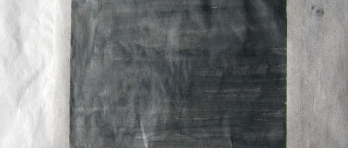
I rubbed the graphite stick onto the tracing paper.


4_Alcohol

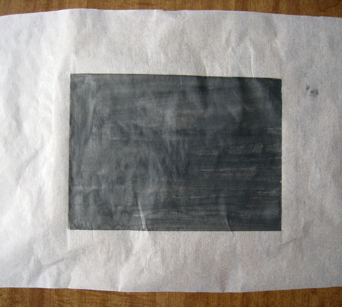
I set a piece of cardboard underneath the tracing paper so nothing would happen to the table (not sure if anything would happen but it doesn’t hurt to be cautious). I put a little bit of the isopropyl alcohol onto the tissue and gently wiped the graphite cover surface of the tracing paper. After that dried I carefully removed the tape. Please have adequate ventilation when using the isopropyl alcohol. It can make it hard to breathe and cause other problems.


5_Paper_Over_Board

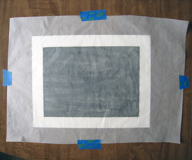
I flipped my DIY graphite transfer paper over and placed it in the correct spot on top of my illustration board.


6_Taped_Drawing

I taped my printout onto the transfer paper.


7_Tracing

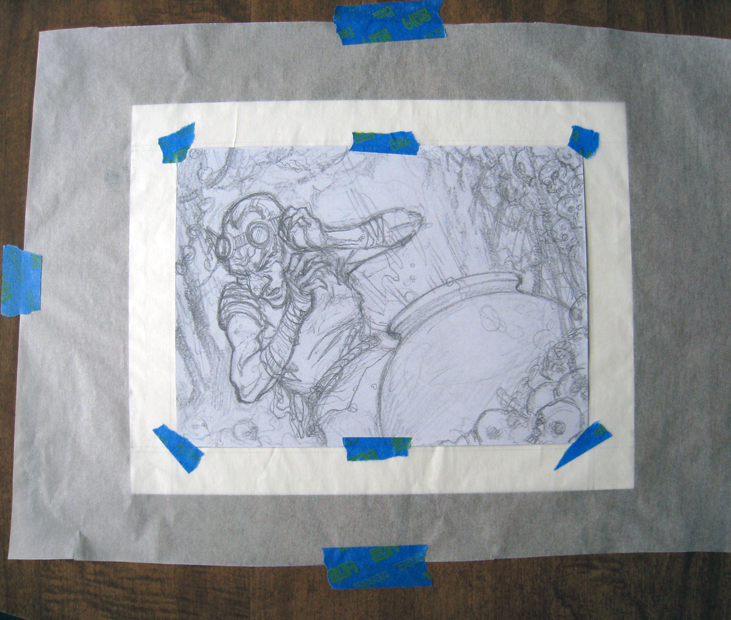
I traced along the lines of my printout using a ballpoint pen. You can use a sharp pencil, or some sort of stylus too.


8_Done
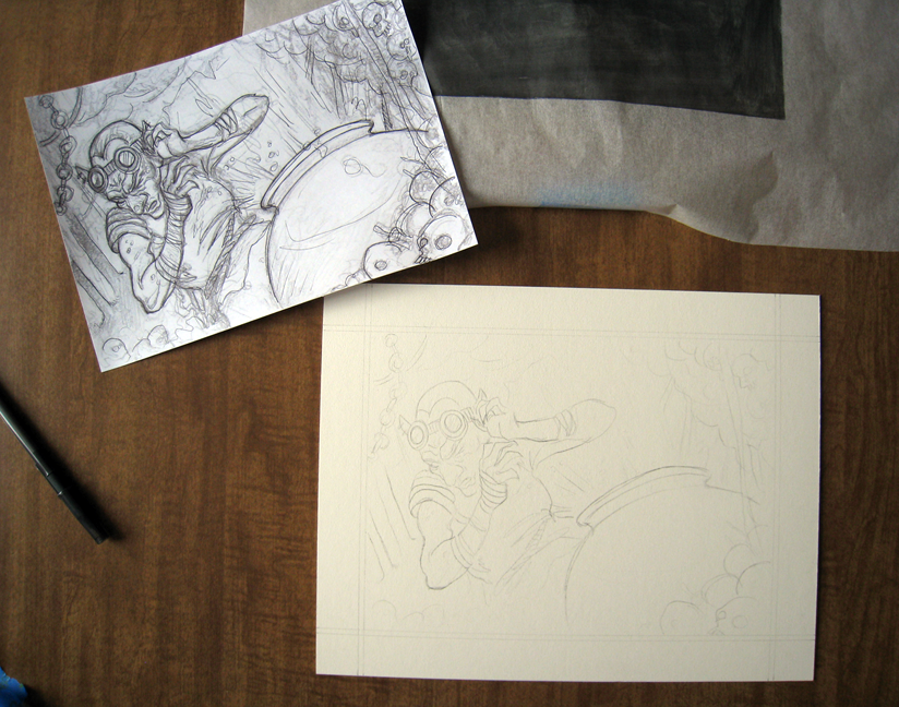
The final transfer! It’s done! Now it’s time refine some things on the drawing and then paint.

If you have other interesting ways to transfer images to your final substrates, I’d love to hear them!

Google Cultural Institute

Van Gogh - The Starry Night Close Up

It has come to my attention that not many people know about Google Cultural Institute (formerly the Google Art Project, but now it includes much more). I love the Google Cultural Institute and you should too. Although I’d much rather see a Peter Paul Rubens (Not to be confused with Peter, Paul, and Mary) painting in person (I’ll add that to my non-existent bucket list), I don’t have the luxury of flying all over the world to see his paintings so Google Cultural Institute is my solution.

Fake disclaimer: Google Cultural Institute is a great website and you’re likely to lose track of time and browse artworks for hours. If you have deadlines or tasks to complete, wait to look at GCI until you have some free time.

Here’s a nifty video to introduce you to GCI:

The Google Art Project (part of the Google Cultural Institute) has hundreds thousands of artworks for you to view in high resolution. You can take a virtual tour through partnered museums, read about the artwork, browse other member’s “collections” of artwork (you can make your personal collection of artwork from the Google Art Project, write things about the pieces you chose, and share with the world), and so much more.

As always, if you click on an image in my posts you can usually see larger images.

Let’s take a quick tour through the Google Cultural Institute:

Here I am browsing the artwork of Peter Paul Rubens. You can scroll left and right to view more art work by Rubens. Notice the little blue “gigapixel” button next to the title of “Venus and Adonis”. There are several gigapixel images on the Google Art Project. You may ask yourself “what is a gigapixel?” You may ask yourself, where is that large automobile? Well you know how cameras have megapixels? Maybe your camera has 12 megapixels (That’s pretty standard). A gigapixel is 1,000 megapixels (Whaaaaat!!!).

Google Cultural Institute - Peter Paul Rubens

Browsing art work by Peter Paul Rubens in the Google Cultural Institute

Let’s take a look at the gigapixel image of “Venus and Adonis”:

Peter Paul Rubens - Venus and Adonis Description

You can get little history lessons about the art.

The descriptions are fun to read and they are very informative (unlike taking an actual art history class where you fall asleep and watch slides on a projector while the teacher drones on in a monotone voice). Enough of that, let’s zoom into the painting!

Peter Paul Rubens - Venus and Adonis Zoom 1

“You are such an Adonis!”

Peter Paul Rubens - Venus and Adonis Zoom 2

Look at the detail!

Peter Paul Rubens - Venus and Adonis Zoom 3

Pearls

Peter Paul Rubens - Venus and Adonis Zoom 4

If you are in an actual art museum and you can see a painting this closely, you need to back up a little before the security guard removes you from the premises.

There’s so much to look at with the Google Cultural Institute. A blog post can barely scratch the surface of how interesting GCI is. Go check it out for yourself! If you want a direct link to the Art Project, click here. And if you want to see the “Venus and Adonis” painting by Peter Paul Rubens, you can click here.

Life Drawings 1-16-14


Life-Drawing-1-16-14-20min

I believe this drawing was completed in 15-20 minutes.

Life-Drawing-1-16-14-10min

10 minutes each.

Life-Drawing-1-16-14-15min

15 minutes each.

Life-Drawing-1-16-14-Long-Pose

A longer pose. I think it took about 30-45 minutes.

After a year long hiatus from life drawing I was anxious to get back into it. Here are some life drawings from 1-16-14. They are all charcoal on charcoal paper (18″x24″). I normally don’t draw with charcoal for life drawings except for gesture drawings. I’m also a very clean person so it’s obvious that I should stay away from charcoal, however, I used it for the last three life drawing sessions and I might continue to use it. Even though it gets all over your hands and paper (and pants, and everything else in close vicinity) there’s just something about it that I like. I’m thinking about breaking out the toned paper soon and trying some charcoal and white pastel/white charcoal drawings. Maybe I’ll switch back to colored pencils on toned paper.

Ink Wash Guy In A Hat

Ink-Wash-Guy-In-Hat

So here’s a little sketch (little because it’s less than 3″ x 3″) I made in mid-2013 (probably June). It’s an ink wash sketch of some sort of guy/creature in a hat. I guess you could just say that it’s an ink wash guy in a hat. Let me know what you think. That’s all folks!

Five Headed Monster Concept Art

FiveHeadedMonsterConcept

Behold My Five Headed Monster Concept Art

In the summer of 2013 I took it upon myself to learn how to 3d model in Autodesk Maya. Years ago I became pretty proficient at 3d modeling in Autodesk Viz (Viz is essentially 3ds Max but stripped down a little bit). I try to learn new skills to open doors to new possibilities and because it is fun to better yourself.

I initially modeled the five headed monster in Maya using very crude shapes. I didn’t want it to be too time consuming and it’s not necessary to make a super detailed model for a reference photo. I set up lighting in Maya and I rendered the scene. I used those images as reference for a relatively quick digital drawing/painting. I mainly wanted the reference images to see the cast shadow shapes, and to accurately space the heads, arms, and legs.

In the corner of the drawing/painting there’s an alternate version of the heads.

Luke Cage Watercolor

I’m still testing out my new waterbrush, but this time instead of painting a castle, I painted Marvel’s Luke Cage aka Power Man (in his old costume of course).

Luke Cage WatercolorHere’s the finished watercolor sketch. It would look a lot better if I had a nice scan of it.

1_Luke_Cage_Pencils

I started with a pencil sketch.

2_Luke_Cage_Inks

Next, I inked the pencil sketch. I erased the pencil drawing too. Luke Cage doesn’t look as angry in the inked drawing as he did in the pencil drawing. That’s just poor inking on my part.

3_Luke_Cage

Adding light washes of watercolor to establish the local color.

4_Luke_Cage

Adding more washes of watercolor.

5_Luke_Cage

Continuing to add more washes (pretty simple, right?)

6_Luke_CageContinuing…


And the final image:

Luke Cage WatercolorOnce I get a nice scan of it I’ll add it to my blog.


Looking Back On 2013

2013 Collage

2013 Highlights

2014 is here and I’m anxious to accomplish many things this year. It’s hard to believe that my blog has now been around for a year (Although technically the first post was on January 10, 2013). I somehow found something to talk about each month! When I first started my blog I had no idea how long it took to create a good post. Some posts take several hours to write, revise (and revise again many times), add photos, and much more. I certainly appreciate the work that blog writers put into their posts, now that I know how much effort is required to post meaningful content.

In this post we are looking back on 2013 at some highlighted posts.

The Monoprice tablet unboxing and review:

Some notable painting process posts:

Some art:

Art book reviews:

Miscellaneous:

I hope you have a happy new year and stick to your new year resolutions (unless your resolution is something awful like drowning 100 kittens; then I don’t hope you stick to your new year resolutions).

The Fantasy Artist’s Figure Drawing Bible Review

Fantasy Artists Figure Drawing Bible Cover

Fantasy Artist’s Figure Drawing Bible: Ready-to-Draw Characters and Step-by-Step Rendering Techniques

Let’s start off with an introduction of the author of The Fantasy Artist’s Figure Drawing Bible, Matt Dixon. How is Matt Dixon qualified to teach anyone about drawing fantasy figures? Well, he has produced art for various video game companies, including Sony Online Entertainment, and Blizzard Entertainment. I think he’s pretty qualified to teach young artists how to draw and paint. You can see his website here. You can see his blog here.

Here are some images of Matt Dixon’s work, taken from his website at mattdixon.co.uk:

Biker Girl

Source: mattdixon.co.uk

Master Marksman

Source: mattdixon.co.uk

Moon Reaver

Source: mattdixon.co.uk

Summer Rampage

Source: mattdixon.co.uk

Those paintings look pretty awesome, don’t they? Yes, yes they do. He seems pretty qualified to write a book about fantasy figure drawing, so let’s talk about the book.

At the time of this writing, The Fantasy Artist’s Figure Drawing Bible was $17.31 with free shipping (on orders over $35) on Amazon. That’s not too shabby for a book with 256 pages, albeit each page is only 5.75″ x 7.75″, so what normally might take up one page in a normal sized art book, could take up three pages in this book (that’s not an actual page rate, I’m just throwing out a estimate). The version of the book that I read is a spiral bound hardcover book. I don’t think I’ve ever read an art book that was spiral bound before this book (And I have read A LOT of art books). It’s not a bothersome format. The spiral bound format is nice because you can have the book open to any set of pages and not worry about having to weigh down one side of the book so the pages don’t fall back onto the other side (If you don’t know what I’m talking about, then try reading a book sometime by just laying it on the table).

The figure drawing bible was first published in 2008 by Barron’s Educational Series, Inc. (or Quarto Inc. I’m not sure if one of those companies is an imprint or not and the inside cover of the book doesn’t really tell me). The book begins with 2 pages that quickly describe how the book is laid out (and once you get to the character directory you will see that it’s the same several page layout for each character). Then there are 6 pages of fantasy artwork (one image per page) from artists such as Jonny Duddle, and Howard Lyon.

Next up is the “Getting Started” chapter, and in this section there are 10 pages total. The first section of the “Getting Started” chapter is 2 pages that list various artists and illustrators, as well as literature, movies, and places that can be of inspiration to the artist reading the book. After that, there are 4 pages that discuss tools and materials. The tools and materials section is very brief and is probably only helpful to the beginner artist. Dixon then compares a couple of techniques (Line vs tinted vs comic etc.), and then briefly talks about working digitally.

After the “Getting Started” chapter, we reach 34 pages about visual language. This chapter discusses things such as fantasy stereotypes, anatomy proportions, constructing the figure, composition, sketching, value, color, and rendering. The rendering section is my favorite part of the book, probably because I am already very familiar with the other rudimentary principles of art. It’s always nice to see an artist’s workflow and process.

Next up there is the “Character Directory”, which is the bulk of the book. In the character directory you are presented with a fantasy character or archetype. There is a full page illustration showing that character and the line art drawing if you wanted to trace or scan the drawing into your computer and try your hand at digital rendering. Dixon talks about the personality of the character, the design choices, developing the design and appearance of the character (including the face, body shape, weapons, etc.), constructing the character and posing them. Also included in each character section is a half page “Artist’s Tip” that can discuss anything from digitally painting skin tones to atmospheric perspective. The book uses the same format for each character, making it easy to digest. Some of the characters in the book include: imp, elf, dark elf, dwarf, mermaid, orc, troll, ogre, hero, etc.

Here are some images of the book, taken from Dickblick’s website:

hero

source: dickblick.com

sprite

source: dickblick.com

treeman

source: dickblick.com

I hope I helped you decide whether you want to purchase, rent, or skip this book. If you have any questions or comments, you can leave a comment or directly message me.