Watercolor Castle Sketch

Watercolor Castle Sketch

Watercolor Castle Sketch

I purchased a waterbrush the other day on Amazon to bump the total in my cart to qualify for free shipping (which is now $35 instead of $25). I had been thinking about buying a waterbrush anyways, so it was the perfect opportunity to finally buy one. I was testing it out with some watercolor pencils that I’ve had for years (And I don’t ever really use them). In fact, I don’t do much watercolor painting at all these days, but I’m looking to change that.

I drew the scene with a normal pencil and then I drew with the watercolor pencils. I then used the waterbrush to brush over the lines, and pick up some watercolor paint from some pans in a little portable watercolor set.

Sometime I’ll probably get a scan of the sketch.

I highly recommend getting a waterbrush. It’s a pretty handy tool and I think it will prove to be very handy when watercolor sketching on location.

Milk and Cookies Process

Milk and Cookies

Baking for Santa

In a past post I showed you my Milk and Cookies painting. I told you to stay tuned for the process shots of the painting and I like to keep my word, so feast your orbs on these Milk and Cookies process photos!

If you follow me on Twitter then you have probably seen this preliminary sketch of my idea for the Milk and Cookies painting:

Milk and Cookies Sketch

This sketch includes dialogue!


Milk and Cookies Process 1

I toned this board a couple of months ago in preparation for a still life painting that I never got around to painting, so I decided to use it for the Milk and Cookies painting. Here we have the hardboard coated with washes of acrylic paint to establish a base color for the painting (also known as imprimatura).


Milk and Cookies Process 2

Next, I drew directly on the board with pencils (probably 2H and HB pencils).


Milk and Cookies Process 3

Then I began oil painting, beginning with some thinly applied darker colors to establish some local color.


Milk and Cookies Process 4

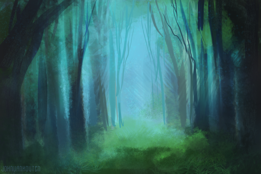
More oil paint is added to the painting! Wow! This photo was taken when the painting was about halfway done. When you reach this point while painting you often need to check yourself and remain calm. The painting doesn’t look so hot. You know better than that! It’s going to be wonderful! You have to remind yourself that all is well and that the painting will come together after you add some highlights.


Milk and Cookies Process 5

Said highlights are added. Doesn’t that look much better? I told you that it would come together.

Then I forgot to take any more photos because that’s what happens when you lose yourself in a painting and really start to have fun. Plus, it’s a pain to have to constantly remove my painting gloves (surgical gloves–so you could say that I do surgery on boards with paint), hunt down the terrible point-and-shoot camera and try hard to get a photo that’s not completely blurred.

I wasn’t sure how I was going to show the glow of the cookies and milk but I decided on a unnatural blue color and I had a blast with the mark making.

Here’s an animated GIF:

Milk-and-Cookies-Process-Animated


Post Processing

It’s not very often that you’re shown the post-process part of the process, so let’s change that. After the painting is dry (I add Liquin to my paint so I only had to wait about 2 days for it to be completely dry–it would have been dry sooner but a few thick brushstrokes of titanium white paint were still damp after day 1 [because the paint was thicker, and because white paint dries slowly]) I bring it to school where I scan it on one of their fancy scanners (The scanners are used by the whole school so they happen to have scratched glass, which means I have to pick out little dust spots and scratches after I scan my artwork).

Once I scan my painting, I edit the scanned painting in Adobe Photoshop and start adjusting the colors and levels to match my original painting. There’s a lot of tinkering with the scanned painting until it finally resembles the original (And then you have things to worry about like the color calibration on your monitor, the level of brightness of your monitor when color correcting scanned artwork, the type of lighting affecting the painting as you compare it to your screen, etc.). It still never beats how the original actually looks in person.


Milk and Cookies Scan

Ew. Look at how flat and lifeless the painting appears.

Here’s what the painting looks like when scanned, but before the digital magic that makes it look like the actual painting (Which probably still doesn’t look close to the original painting because of how our monitors are calibrated).


Milk and Cookies Post Processing

Here’s an image of my layers palette, showing you all of the adjustments I had to make to the scanned painting. This doesn’t show the dust and scratches I removed either.

Here’s an animated look at the before and after of the digital post processing:

Milk-and-Cookies-Before-After

Some day I’ll probably do an entire blog post about post processing for artwork.

 At The Gallery

Non Christmas Christmas Show

Notice the great looking frame on that painting.

Finally, here I am at the Fountain Street Church Keeler Gallery Non-Christmas Christmas Show. The show runs through January 2, 2014, so get there while you still can!

I had the painting framed by MercuryHead Gallery. I’m always satisfied with the service they provide and I enjoy talking art with the folks over there.

You can purchase the Milk and Cookies painting! Talk to the people in charge at the Keeler Gallery in Fountain Street Church, or contact me. If you’d rather buy prints, or pillows, or what have you, then you can stop by my Society6 store and do just that!

If you have any questions or comments, please feel free to drop my a line in the comments.

Milk and Cookies

Milk and Cookies

5″ x 7″ acrylic and oil on panel

Here’s an oil painting (technically acrylic paint, pencil, and oil paint) of mine that is currently in the Fountain Street Church Keeler Gallery Non-Christmas Christmas Show. In my “Anticipating Milk and Cookies” post, I showed a little preview of this painting. The show is running until January 2, 2014. Please go check it out (there are a lot of subtle details and colors that are better seen in person) and if you want to purchase the painting, you can purchase it at the show, or you can contact me (the same goes for pretty much any of my art). Stay tuned for the process shots of the painting!


Note: the painting looks pretty accurate when I turn my screen brightness up but otherwise it’s pretty dark. I’m not sure how bright my monitor should be when color correcting artwork. Any thoughts?

You can purchase prints of this painting, as well as other items on my Society6 store.

Anticipating Milk and Cookies

Santa loves milk and cookies. I painted him anticipating some milk and cookies. Here’s a sneak peek of a painting that I have in the Fountain Street Church Keeler Gallery Non-Christmas Christmas Show. The theme of the show is Anticipation. The show runs November 27, 2013 through January 2, 2014. This photo was taken during the process of the painting, so some things have changed. I’m pretty sure that I took several process photos, so stay tuned for more art!

Santa anticipating some milk and cookies

Monoprice Tablet Review

Monoprice Tablet Stock Photo

It’s time for my long-awaited Monoprice tablet review.

In January of 2013, I unboxed the Monoprice tablet and showed you the photos. I also included some size comparisons. I encourage you to check out the unboxing post so you can see the size comparisons and what comes with the drawing tablet. Anyways, I said that I would review it and I try to stick to my word, so here’s my Monoprice tablet review.


For the money ($56.61 as of the time of writing this review) you will be hard pressed to find a better drawing tablet. The tablet is similar to Wacom’s Intuos3 line of tablets (Not necessarily in that it looks similar to the Intuos3 tablets, but that it functions similarly). The Intuos3 tablets cost HUNDREDS of dollars. The price of the Monoprice tablet isn’t even a triple digit number.

Wacom has been running a monopoly in the digital drawing tablet market and it’s time for that to change.

Slowly, manufacturers (Monoprice, Huion, Hanvon, Yiynova etc.) are starting to break into the tablet scene and give Wacom some competition. Wacom is similar to Apple in the way that they both overcharge for what they are selling. People still buy their products regardless of the monumental prices because of the status and design.

If you were to gut a Cintiq (Wacom’s pen display) you would probably find parts that when totaled together, do not cost the outrageous prices that Wacom charges. There are people who use Wacom’s existing tablets and they make their own pen displays like the Cintiq but for a fraction of the price–further proof that Wacom overcharges you for sleek design. I know that this is capitalism and Wacom needs to profit so that they can pay their employees, create new products, and much more, but making a profit is one thing–ripping off your customers is another.

Wacom, like Apple, also release “new” products that are simply just slight revisions on past versions. For example, Wacom’s Intuos5 is essentially the same product as the Intuos4 but with touch capabilities (only some models have the touch capabilities). To me, that doesn’t seem like enough of a difference to warrant a number change from 4 to 5.

Now don’t get me wrong, I like Apple (I have several Apple products), and Wacom makes nice hardware (I someday hope to own a pen display like the Cintiq, if they lose their premium price) but I think that competition would be good for Wacom and that is why I chose to buy my drawing tablet from Monoprice. Competition between businesses is a good thing.

Another reason I decided to use a Monoprice tablet instead of a Wacom tablet is because I heard about a horrid thing called the “shoelace effect” affecting the newer Wacom Intuos tablets. You can learn more about that in this conceptart.org thread.


Here’s how I test my equipment:

Testing The Monoprice Tablet

Rigorously testing the Monoprice Graphics Tablet.

Now it’s time for the good, the bad, (the neutral) and the verdict:

PROS:

  • Inexpensive. The Monoprice tablet cost me about $56. Wacom wants hundreds of dollars for their products, although their newly revised (and re-named to Intuos) Bamboo tablet line is pretty impressive for the price.
  • Bang for the buck. The tablet performs very well and for the price, you are getting a great tablet.
  • Competition for Wacom. Wacom needs to be taken down a notch and some competition is healthy and good for the market. If Wacom suddenly feels threatened by the emergence of competitor’s tablets and pen displays, then they will improve their products (better hardware for less money) and value. The competition will then improve their products–rinse and repeat. This is good GREAT for the consumer. Maybe Wacom would stop releasing minor revisions as new tablets (see the intuos4 product line to the intuos5), and their products would be affordable.
  • Pen weight. The pen isn’t overly heavy or too light. It’s just personal preference to me. I don’t have experience with other tablet pens so I can’t comment on how it compares in weight/size.
  • Sturdy and affordable enough that you can throw it in your bag and not worry about it breaking. If it breaks you can just buy another one because it’s so affordable. Disclaimer: I wouldn’t encourage literally throwing it into your bag (or anywhere).
  • Slick surface. The nib on your pen doesn’t wear down as quickly as on a paper-like surface (see Intuos4 surface)
  • It’s not Wacom! 

NEUTRAL:

  • AAA battery pen. Although the pen requires 1 AAA battery, I haven’t had to change the battery yet since I bought the tablet. You will quickly forget it even requires a battery.
  • Hotkeys. I can’t say much about the hotkeys because I don’t use them.
  • Transparent flap thing. You can place drawings or photos underneath the transparent drawing surface (for tracing?). I have never used that feature. 

CONS:

  • Slick surface. Yes I know this was also a “pro”. Some people like drawing on slick surfaces (like the Intuos3) and some people don’t. I don’t really have an opinion on it, as I haven’t used the paper like surface of the Intuos4 and 5. I have a feeling that I would like a surface that’s not so slick. I know that a lot of people don’t like the paper-like surface of the Intuos4 and 5 because it wears the nibs/tips down quickly. Of course you can buy replacement tips for Wacom’s products but they charge you MUCH more than what the tips should cost. (By the way, if you have a Wacom tablet and you need to replace your nibs, just make your own)
  • Pen requires a AAA battery. This isn’t really a big deal but a “con” nonetheless. Remember, I still haven’t had to replace the battery yet. Also, AAA batteries aren’t expensive.
  • No eraser. There is no eraser on the rear of the pen. It doesn’t bother me. I just switch between the brush and eraser in Photoshop by clicking ‘b’ and ‘e’. Many of my Wacom-using-friends tell me that they don’t even use the eraser feature on the Wacom pens (Maybe I could count this as a “neutral” instead of a “con”).
  • Cheap rubber grip on pen. The rubber grip around the pen slides if you have a tight grip. I might be too stressed and it’s hard for me to relax so maybe that’s just a problem with me (if you want to help me relax, I accept technology, art supply and monetary donations).
  • Nib wear. The nib can sharpen into a chisel. I don’t have enough experience with Wacom tablets to know if they do that too.
  • Not wireless. I don’t really mind that it’s wired (the cord is long enough for me) but it would be a definite plus if the tablet was wireless.
  • Some slow almost 45 degree strokes will jitter. This may be the software I’m using, the operating system I have, the way I draw, the digitizer in the tablet, or many other things. I’m not sure if it’s the tablets fault. There are too many variables to narrow down what causes it. Most people don’t seem to notice.

Let’s take a look at the specs:

  • Overall dimensions: 14.5” x 12” (I think it’s closer to 14” x 11”).
  • Active drawing area: 10” x 6.25”.
  • Pen is about 6.25” long and at it’s thickest spot it’s almost ½” thick.
  • The cord is about 56” long
  • Resolution (LPI): 4000
  • Report Rate Speed (RPS): 200
  • Pressure Sensitivity: 1024 levels
  • It also comes with some software that’s probably horrible, and you probably wouldn’t ever use it anyways. I don’t even know if it’s mac compatible software.

Let’s take a look at the settings you can change in the driver for the tablet.

Monoprice Pen Tablet Settings Info

They could have probably used a better picture for the “info” screen in the tablet settings.

Monoprice Pen Tablet Settings Buttons

You can assign different things to the buttons the pen. I don’t even use the two buttons on the pen.

Monoprice Pen Tablet Settings Scope

Here you can change the active drawing area of the tablet. You can make the active area smaller so that your brush strokes will be longer and smoother. I think I’ll probably change my settings soon. It’s kind of annoying having to move my whole hand when I need to reach the far corner of the screen.

Monoprice Pen Tablet Settings Hot Keys

You can assign different programs or commands to the hotkeys or “hot cells” as they call them. I unassigned all of the hotkeys so I wouldn’t accidentally open the web browser or paste something. Even if you left all of the hotkeys as they were, you would probably have no trouble keeping your pen away from them. I did it JUST IN CASE.

Monoprice Pen Tablet Settings Pressure

Here you can adjust how hard or soft you need to press the pen.

If the Huion H610 existed before I purchased the Monoprice tablet I may have purchased the H610 instead. I’m happy with my purchase and I don’t regret choosing the Monoprice tablet. I’ll probably buy the H610 some day and see if I like it more than the Monoprice tablet. The Monoprice tablet is a bit too large for my tastes. With digital painting it’s easiest to draw from the wrist. Smooth curving lines and stiff straight lines are difficult to paint/draw on a tablet. Having a smaller active area to draw on makes it easier to achieve smooth curving lines and stiff straight lines. After you install the drivers for the Monoprice tablet you can adjust the active area on the tablet. I never tried to change it. A smaller tablet would also take up less space and that’s always a bonus.


VERDICT: BUY THIS TABLET (on Amazon because after shipping from Monoprice it’s more expensive).

For less than $60 the Monoprice tablet is a great value and good competition for Wacom. If you don’t want to spend hundreds of dollars on a tablet, or you want to buy a tablet that isn’t made by Wacom, then this tablet is a solid choice.

Speed Paintings Circa Early 2013: Part Two

Here’s part two of my two part post of early 2013 digital speed paintings. If you missed part one, you can view it here. In part one I mention that I had just gotten a drawing tablet at the beginning of 2013 so digitally painting has been a big learning experience. These are five other digital speed paintings that I made in early 2013 while learning the ropes of the digital world (still struggling).

Enough of my talking, here are the “paintings”:

Abstract Gloomy Landscape Speed Painting

Abstract Red City Speed Painting

Jungle Speed Painting

Yellow Orange Landscape Speed Painting

Red Alien Landscape Speed Painting


Have a great day!

Drawing and Painting Fantasy Figures Review

Drawing_and_Painting_Fantasy_Figures_Cover

Drawing and Painting Fantasy Figures: From the Imagination to the Page

Here’s my quick review of Drawing and Painting Fantasy Figures by Finlay Cowan. I wrote this review a couple of months ago and forgot to post it. Don’t buy this book unless you have no idea that wizards are in the fantasy genre, or if you want to learn how to draw badly. I don’t have any personal grudges against Finlay Cowan (he has good ideas and his design work is nice but he definitely isn’t known for his draughtsmanship) but wow, this book is bad (Although it’s not so bad that it should be burned–it’s just a bad art book in my opinion). Most of the drawings seem amateurish (or maybe all of the twelve-year-olds that I see draw are trying to copy his style), and unless somebody can draw well, I don’t think they should teach anyone else how to draw. The 3d modeled images in this book are terrible. However, I have to remind myself that this book was published in 2003 (so the 3d modeling obviously won’t hold up to the 2013 3d standards).

I have to give Finlay Cowan kudos for including so many topics in one book (perspective, anatomy, painting, storyboarding etc.), but the reader would be better off if they learned perspective, anatomy, painting, and storyboarding from other books dedicated to those subjects.

One of the only things I found interesting in this book were the designs that Finlay Cowan drew for Pink Floyd album art (seen below).

Finlay_Cowan_Pink_Floyd

Image from Amazon.com

If you really want this book, you can buy the book here. I don’t understand how, but at the time of writing this review, Drawing and Painting Fantasy Figures has an average 3.8 rating (out of 5 stars) on Amazon. Maybe the reviewers are much younger than me. Maybe they can’t draw very well or haven’t read very many art books. Whatever the case, some people enjoyed this book so you might too (though I hope you have higher standards for art books than those reviewers on Amazon).

Speed Paintings Circa Early 2013: Part One

Today you get the pleasure of seeing 5 digital speed paintings I made in early 2013 (and an animated GIF of one of the speed paintings, showing the different layers!). I had just gotten a drawing tablet so it was a big learning experience. I’m still not completely comfortable digitally painting but I’m much better now than I was then (of course). All of the digital speed paintings were made in Adobe Photoshop CS5.

Keep your eyes peeled for part two, featuring 5 more digital speed paintings from early 2013! This also marks the first time I split up a blog post into 2 parts! Everybody celebrate! Also on the topic of digital painting, I will have my long awaited review of the Monoprice Tablet ready in the very near future (meaning that I actually started writing it and I just need to revise it).

Desert Oasis Speed Painting

Grassy Hills Speed Painting

Grassy-Hills-Speed-Painting-Animated

Animated GIF showing the different layers of this speed painting

Marsh Speed Painting

Space Speed Painting

And my favorite of the batch (perfect for Halloween because it’s spooky):

Spooky Forest Speed PaintingAs always, I love to hear your questions or comments (if you’re not too busy preparing your Halloween costume).