Here is a speed painting I completed several weeks ago. It is a red landscape (from my imagination!) digitally painted using Adobe Photoshop CS5. There’s not much else to say about it. Now that I think about it, this image may be more orange than red. Let’s just say it’s a Cadmium Red Light landscape.
Author: John Van Houten

Casein Painting: Methods and Demonstrations Review
Casein Painting: Methods and Demonstrations Review
What is casein paint? According to Wikipedia (teachers just love it when you cite Wikipedia), casein paint is a fast-drying and water-soluble paint made from milk casein (casein is a type of protein [eating casein paint will not make you stronger]). Casein paint has been used for a long time. When casein paint thoroughly dries it becomes water resistant (like acrylic paint). Casein paint is a fairly versatile medium. It can be used like watercolor or gouache, and dries to a nice velvet-like matte finish. When dry (and isolated using a varnish), casein paint can be used as an underpainting for oils. According to Casein Painting: Methods and Demonstrations, casein paint “provides an excellent stepping stone for the watercolorist who wants to do oil painting, and for the oil painter who may have hesitated in the past to attempt watercolor.” I was first introduced to casein paint in a Stephen Quiller book (maybe I’ll review it some day). If that’s not enough of an introduction to casein paint for you, feel free to check out this thread on the WetCanvas forum.
Now that we all know what casein paint is, we can move along to the review. The book is Casein Painting: Methods and Demonstrations by Henry Gasser. This book had its first print in 1950 (before computers, cars, fire, and language [basically the ice age]). You can buy it on Amazon.
Henry Gasser covers the materials used when painting with casein paint (brushes, palettes, surfaces), casein paint as watercolor, using casein paint opaquely like gouache, painting with casein paint on gesso panels, making an underpainting with casein, mounting paper, etc. If you want to know more about those things you should read the book.
Henry uses the following palette:
![]() Cadmium Yellow Light
Cadmium Yellow Light
 Cadmium Orange
 Cadmium Red Light
 Alizarin Crimson
 French Ultramarine Blue
 Phthalocyanine Blue
 Phthalocyanine Green
 Yellow Ochre
 Raw Sienna
 Burnt Sienna
 Indian Red
 Burnt Umber
 Ivory Black
 Titanium White
 Chromium Oxide Green
 Davy’s Gray
The paper in Casein Painting: Methods and Demonstrations has a nice gloss but tears easily when turning from page to page (the book is old so perhaps in its prime the pages didn’t tear so easily). There are a total of 7 color reproductions in this book. I wish all of the images were printed in color but I understand that the publisher saved money by printing it mostly in black and white. Casein Painting is a fairly short book, being only 67 pages long (or short), but had the author decided to bulk up the book by including frivolous information, then the book would be too long. The 67 page length seems just about right for Casein Painting.
I think that this book is a good introduction to casein paint and provides practical examples of how to use casein paint. If you collect art instruction books, this may be a nice addition to your collection (just remember to be careful when turning the pages). As of this review, Casein Painting can be purchased on Amazon for $15.20.
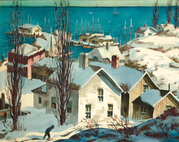
Here’s a taste of what Henry Gasser’s paintings looked like:
Mountains and Lake Speed Painting
 Body of Water, Big Hills
Here’s another speed painting I did a couple of weeks ago. As you can see, it is a mountain range and a body of water of some sort. That’s why I’m referring to it as Mountains and Lake. This is actually the third digital speed painting I did. The first two are not to be seen by human eyes. This was digitally painted in Adobe Photoshop CS5 using my Monoprice drawing tablet (the unboxing of that drawing tablet can be seen here).
In other news, it’s currently snowing in Michigan…in April. You never quite know what to expect from the weather here.
Antarctic Speed Painting
 Here is another speed painting of mine (an antarctic speed painting!). This was “painted” a couple of weeks ago (sorry it took so long to put it on here). It may have nothing to do with the arctic at all. Some nice chunks of ice and water are present in the image. I’m still learning and I’d be lying if I said that digital painting wasn’t frustrating. It is frustrating, but pushing forward even though something is frustrating is how you get better.
This digital painting was painted in Adobe Photoshop CS5.
Colored Pencil Painting Bible Review
My Colored Pencil Painting Bible review.
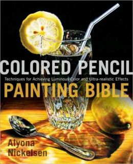
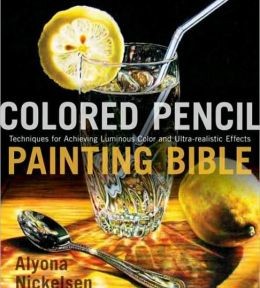
The book that I’m reviewing today is Colored Pencil Painting Bible: Techniques for Achieving Luminous Color and Ultra-realistic Effects by Alyona Nickelsen. The first thing that I noticed about the book was the cover (duh). That’s a pretty great colored pencil drawing (or painting as the author calls them). The basic technique used throughout the book is essentially layering color with wax based colored pencils (Prismacolor pencils), using solvent (such as Gamblin’s OMS Gamsol) to remove visible pencil strokes and blend the colors together, and finally layering more colored pencil (burnishing where needed) to complete the “painting”.
In the Colored Pencil Painting Bible, Alyona talks about different types of paper, pencils, solvents, and other things such as erasing tools. She tells the reader about color charts and how the reader can create them. This book briefly covers art fundamentals such as composition, color, value, light, and shadows. The author also talks about different pencil strokes, blending, layering colors, burnishing, and image transferring.
At the end of the Colored Pencil Painting Bible the author includes charts that list the lightfastness (how permanent or unaffected by light the color is) of colored pencils. The information can be useful to artists who use colored pencils such as Caran d’Ache Luminance, or Faber-Castell Polychromos. The majority of artists that I know (including myself) who use colored pencils prefer Prismacolor Premier pencils. The charts have no lightfastness ratings for those pencils, which was a huge letdown for me. Thankfully for you, I took the initiative to find the lightfast ratings for the Prismacolor Premier colored pencils. You can see that chart here.
One nice tip I took away from this book is how to obtain a rich black color. Alyona applies black colored pencil to the paper (she prefers Stonehenge), and melts the wax with an OMS wash. Next, she layers indigo blue, dark green, and tuscan red. She then adds another layer of black and blends the mix with a colorless blender.
While I think that Alyona’s technique is nice, I think that the book could be shorter and have a smaller price tag (although as I write this review the book is only $17.15 on Amazon). I think that it has too many exercises in it that just bulk it up. This book provides a good foundation for anyone interested in furthering their knowledge of colored pencils, or anyone who is interested in taking colored pencil art seriously. I recommend at least checking it out from the library if you are serious about colored pencil art.
There you have it! That’s my Colored Pencil Painting Bible review.
Peter Portrait Painting Process
Here’s a look at the portrait painting process for my painting of Peter (my brother). This is painted in oils and it was my first assignment for my Alla Prima class last semester. Sorry for the less-than-stellar photos (a couple of them were taken with a cell phone).
This was a very new technique to me at the time and I was very reluctant to make heavy painterly marks. I began the painting by laying down thinned down washes of color. The shadows in the painting were left fairly thin and the highlights are the thickest opaque spots of paint. I believe that John Singer Sargent painted the same way. This was also my first time painting on canvas board. 
Waterfall Speed Painting
I’m still very new at digitally painting, and using a drawing tablet still feels foreign to me. However, I have been practicing. Here’s a recent speed painting of a waterfall. I don’t remember how long it took as I have no sense of time when doing anything art related (besides deadlines). I’m guessing that it was about 10 minutes? I’m looking forward to the great deal of progress ahead of me in the digital realm.
The Cave Process

Drawing Development In Children
When does childlike imagination end? Look at the Drawing Development in Children table to find out!
Recently while browsing the web I came across an interesting table that talked about the stages of art development in children. Why should you care about the drawing development of children? I think it’s worth a look as it shows us when the childlike imaginative drawings stop and when non-artists are generally weeded out. Some people think that artistic talent is some magical gift that some people receive at birth. Others think that artistic talent is the result of years and years of the blood, sweat, and tears put into practicing making art. I believe that it’s a little bit of both.
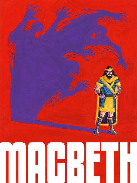
Macbeth Painting Process
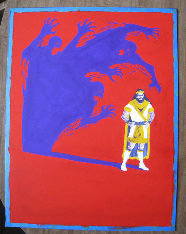
Let’s take a look at the process for my Macbeth painting.
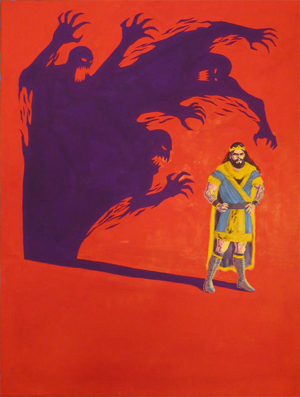
Last year I had to paint a poster for a play or a musical (some type of theatre). My limitations were that I had to use only 4 colors, with the addition of black and white. I chose to paint a poster for the play Macbeth. I thought that I’d give painting with gouache another chance since I had pretty much abandoned it since my color theory class a few years ago.
The four colors I used were Flame Red (Holbein), Permanent Yellow Deep (Holbein), Iris (Holbein), and Primary Blue (Winsor & Newton). In addition to those four colors I was allowed to use white and black. I used Permanent White (Winsor & Newton) and Jet Black (Winsor & Newton).
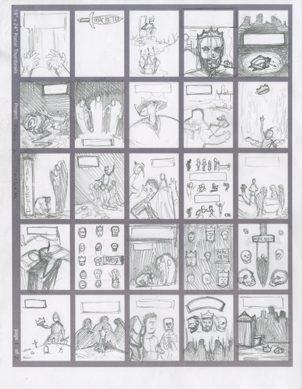
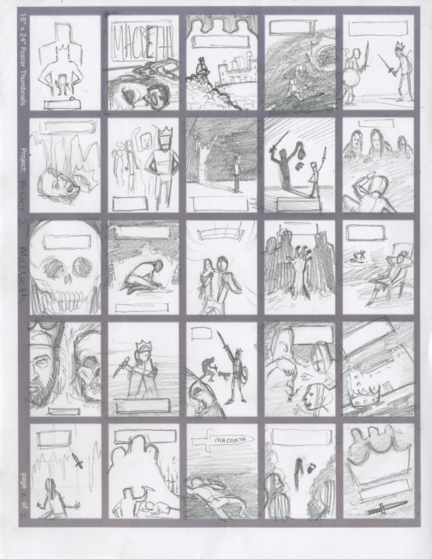
You can see the thumbnail sketches I did below:
I then picked out my nine favorite thumbnail sketches and drew slightly larger refined thumbnails of those nine sketches. The nine refined thumbnails can be seen below:
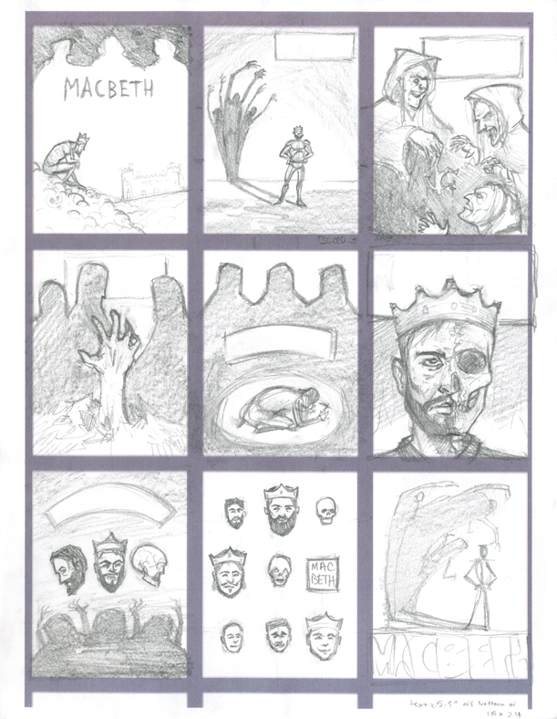
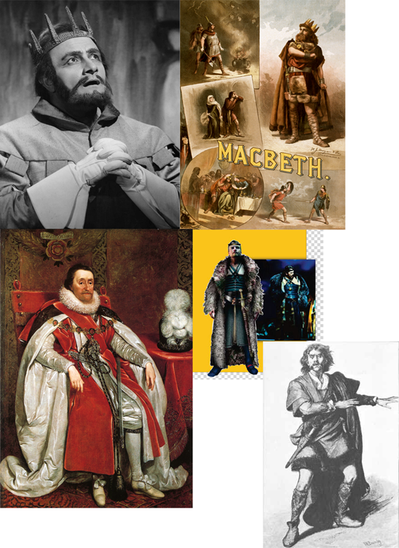
I decided that I liked the bottom right corner thumbnail the most. I gathered some reference photos of Macbeth characters from on the internet.
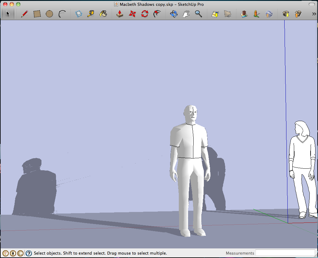
I found a Sketchup model of a person and set up lighting to find the direction of the cast shadow. I’d like to use Sketchup more in the future.
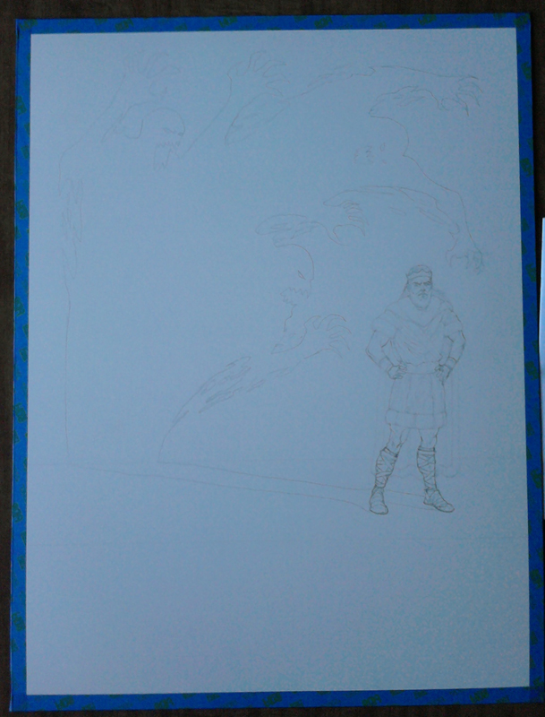
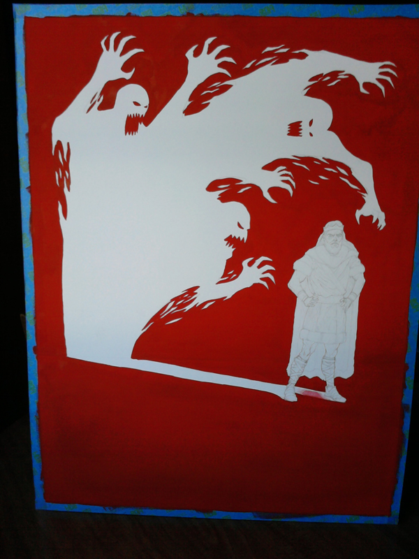
It was time to do the pencil drawing, which once completed, I projected onto illustration board and refined the drawing even further.
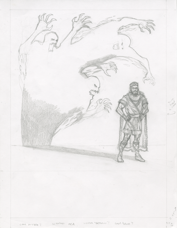
After the pencilled image was drawn I needed to decide what colors to use for the painting. I printed two reduced 3″ x 4″ images of my pencilled drawing and taped them to some cardboard with painters tape. Below are the two color studies I did:
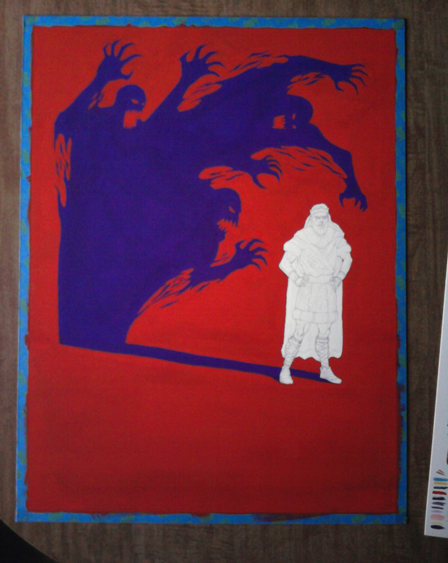
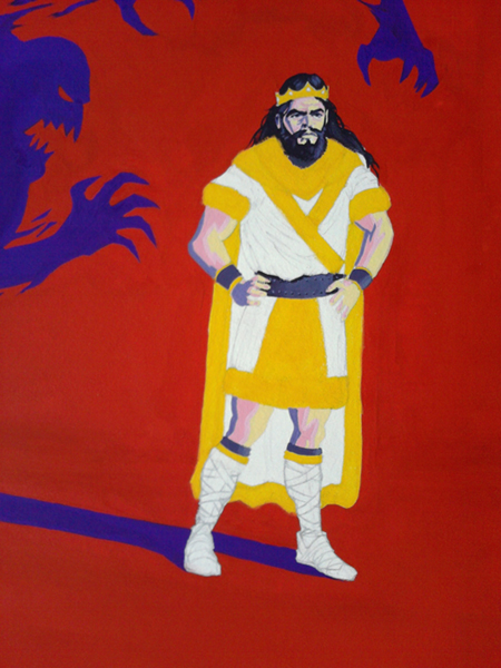
After the color studies were finished I proceeded with the painting.
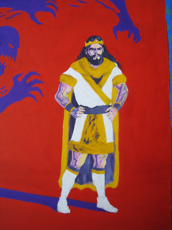
The trickiest part of the painting (besides maintaining a consistent viscosity of paint) was painting Macbeth’s flesh without mixing the colors together. Although I could use four colors plus black and white, I could not mixed the colors together (except with black and white). For example, I could not mix red and yellow together to make a nice orangey flesh color. I had to use red plus white and/or black, yellow plus white and/or black, without overlapping.
After the painting was completed I scanned it into the computer for the usual color correcting and removal of dust from the scanned images. My teacher recommended that I make the shadow a little lighter and I thought the painting looked better that way as well. I lightened the shadow a little bit and then I added the text.
If you don’t know the story of Macbeth, I highly recommend reading it. It’s a great story and although I read it years ago, it still resonates in my mind.


