Little Marker Monsters

Little marker monsters. That’s what happens when I am left alone with markers, pens, and some paper. I had some scraps of printmaking paper left over from my printmaking class and I was curious how markers would handle on the printmaking paper and what they would look like. I believe the paper is Rives BFK. I used Prismacolor Premier markers and Faber-Castell Pitt artist pens (mostly the brush pen).

Most of these little marker monsters were amorphous marker blobs on the paper and after the marker splotches dried I used the Pitt pens to create creatures. I didn’t know what I was going to draw but I let the shapes feed my imagination and I let my pen discover the creatures hidden in the blobs of color. At that point, if I wasn’t completely satisfied I would add some additional shapes or coloring (like a shadow) with the Prismacolor markers.

The Rives BFK paper really soaked up the ink from the markers and bled a bit (marker bleed is when the ink from the marker is soaked up into the paper like a sponge and it spreads out). I couldn’t do much coloring on top of the Pitt pen ink because the alcohol in the markers caused the ink from the pens to smudge and bleed a little bit too.

Each one of these tiny little marker monsters is about 1-1.5″ x 1-1.5″. They are TINY. That’s part of the fun for me. The words and odd colors in each image are part of my experiments and notes when I was testing out the markers on this paper. The notes and other marker tests aren’t really relevant to the little marker monsters so I cropped that stuff out (and some of the little monsters were upside down and this way you can more easily view them). I definitely plan on doing more of these little marker monsters. And now, the moment you’ve been waiting for!

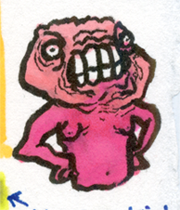
First up is Angry Big Head (yay for creativity in choosing names!):

Angry Big Head

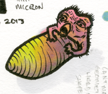
Next, we have the Cocoon Monster:Cocoon Monster

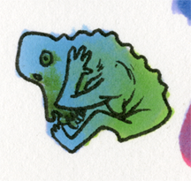
The Cowering Baboon Creature:Cowering Baboon Creature

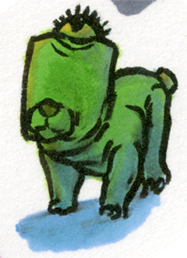
One-Eyed Dog Creature:One Eyed Dog Creature

Parasite Gradient Gryphon (my favorite):Parasite Gradient Gryphon
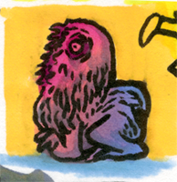
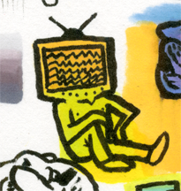
Television Head:Television Head

Two-Armed Sideways Mouth Monster (an example of my terrible naming ability):
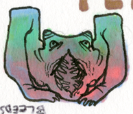
Two Armed Sideways Mouth Monster

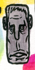
Long Gray Face:

Long Gray FaceWhat do you think?

Classic Still Life Painting Review

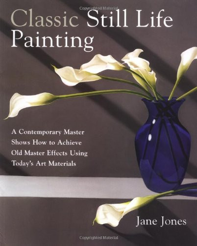
This post is my review of Classic Still Life Painting: A Contemporary Master Shows How to Achieve Old Master Effects Using Today’s Art Materials by Jane Jones.

I recently read two different still life painting books because I have been in the mood to paint some still life paintings. I did some research online and ended up reading Classic Still Life Painting, and Still Life Painting Atelier. Watson-Guptill publishes both books (it seems like almost every book I read is published by Watson-Guptill).

Classic Still Life Painting Jane JonesClassic Still Life Painting is focused on painting still lifes with transparent glazes of oil paint. Painting with transparent glazes (a la watercolor) creates luminosity not possible through strictly opaque application of paint because of the way light bounces through the paint (perhaps I’ll do a blog post about that). She covers five pages of materials for painting and then jumps right into some color theory and color palettes, also differentiating paints that are transparent and those that are opaque. Jane has some helpful tips on creating your own color charts (color charts/color notes are helpful formulas of color mixtures that the artist references to accurately re-mix paint if needed). Throughout the book, Jane shows her color notes/charts and it might seem overwhelming for the beginning oil painter. Don’t worry so much about the color mixtures that she mixes from her smorgasbord of oil paints, and instead focus on the technique she is using to paint.

She talks about preparing a support (the surface that receives the paint), blending, using an alkyd such as Liquin, and lighting a still life. Jane primarily photographs her still life setups and paints from many different photos of the scene. She discusses some tips for photographing a still life.

Jane talks about accurately drawing and perspective in the next chapter, as well as the steps she takes to draw her demo still life. She then paints an underpainting and begins glazing many layers of paint. She shows another painting using the same methods but with slightly different elements. This continues for the rest of the book until the end where she talks about varnishing.

Something that bothered me about the book Classic Still Life Painting, is that Jane naggingly reminds the reader that they should use alkyd medium in each subsequent layer on the painting. Sure, she could mention that once, but the reader might miss it and it’s kind of important. I suppose a couple reminders are okay, but she makes a point to slip that “helpful hint” into the text so many times that it started to drive me nuts. I get it! I should use Liquin in every layer! OKAY! Additionally, after the first couple demos, the book seems a bit repetitive and I lost my interest (but that doesn’t mean you will lose interest!).

Overall, I think Classic Still Life Painting is a nice book and it can certainly be of value to beginning oil painters, watercolorists transitioning to oil painting, and artists who want to try a classical technique to paint still lifes.

Stay tuned for my next still life book review blog post where I review Still Life Painting Atelier by Michael Friel.

Winter Forest Speed Painting

Another Winter Speed Painting!

Here’s yet another winter speed painting! Digitally painted in Adobe Photoshop CS5. I had the idea for this speed painting after wearing some of those sepia tinted glasses the eye doctor gives you after they dilate your eyes, and looking at the woods behind my house (in the winter). The basic concept is an overall brown tint but with cool blue snow. I think I’ll eventually do an oil painting of this scene and concept.

Winter Forest Speed Painting

Winter Speed Painting Animated GIF

Winter Speed Painting Animated

Here’s an animated GIF of a winter speed painting I did a while ago, and several different variations of the same image. I digitally painted this as a color study for a miniature oil painting. When I get a chance to scan the oil painting, I’ll post it online. If you don’t see this image changing, give it a moment, your internet may be slow (or something went terribly wrong on my end).

Winter Speed Painting Animated GIF

Dad

Dad – Oil on Hardboard. 18″ x 14″

Dad

Here’s an oil painting of my assassin dad (note to FBI, he’s not actually an assassin). This painting took much longer than it should have. I finished it earlier this year (it was an assignment from one of my first oil painting classes a year or so ago). I basically used this painting over the course of a year or so to teach myself how to paint. By the time I was almost done with this painting I was taking an alla prima painting class and it was extremely hard to continue painting in this hyper-polished painting style (this was the kind of painting style I had to resist to complete this painting). A little bit of the alla prima painterly brushstrokes are visible in his facial hair. This painting went through a lot of major transformations during its creation. I don’t think I took many photos of this painting in progress but I’ll see what I can dig up. It was really hard to get my father to make a serious face for the reference photos. The painting looks a lot better in person because it doesn’t have those annoying glares that the scanner picks up.


On a related note this is one of the first paintings I did on my own hand primed surface. I used hardboard (it’s not called Masonite you buffoons!) that I purchased from Lowe’s. I believe it’s 3/16″ hardboard. My father and I cut the hardboard on his table saw. I sanded and gessoed (not using traditional gesso, but rather an acrylic emulsion) the hardboard myself. I applied the “gesso” with a foam brush. That was a terrible mistake (or maybe the gesso I was using was bad). Somehow little bits of hard gesso would catch on the foam brush and drag into the gesso application, leaving random vertical and horizontal indents. If I redid this painting I’d make sure to get an even surface on the board before painting (and I’d re-cut the board using a band saw).

Red Landscape Speed Painting

Red Landscape Speed Painting

Here is a speed painting I completed several weeks ago. It is a red landscape (from my imagination!) digitally painted using Adobe Photoshop CS5. There’s not much else to say about it. Now that I think about it, this image may be more orange than red. Let’s just say it’s a Cadmium Red Light landscape.

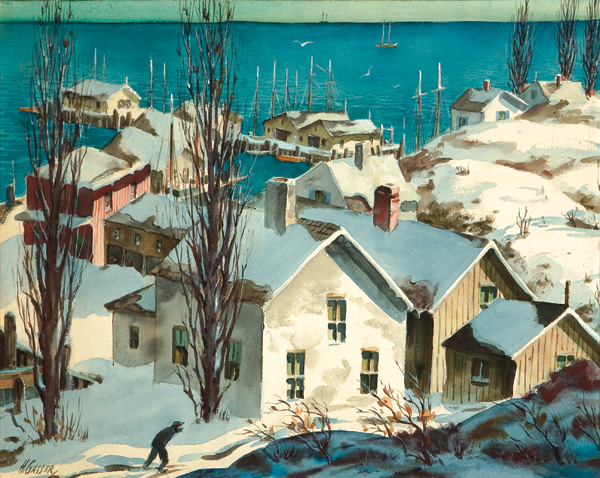
Casein Painting by Henry Gasser

Casein Painting: Methods and Demonstrations Review

Casein Painting Cover

Casein Painting: Methods and Demonstrations Review

What is casein paint? According to Wikipedia (teachers just love it when you cite Wikipedia), casein paint is a fast-drying and water-soluble paint made from milk casein (casein is a type of protein [eating casein paint will not make you stronger]). Casein paint has been used for a long time. When casein paint thoroughly dries it becomes water resistant (like acrylic paint). Casein paint is a fairly versatile medium. It can be used like watercolor or gouache, and dries to a nice velvet-like matte finish. When dry (and isolated using a varnish), casein paint can be used as an underpainting for oils. According to Casein Painting: Methods and Demonstrations, casein paint “provides an excellent stepping stone for the watercolorist who wants to do oil painting, and for the oil painter who may have hesitated in the past to attempt watercolor.” I was first introduced to casein paint in a Stephen Quiller book (maybe I’ll review it some day). If that’s not enough of an introduction to casein paint for you, feel free to check out this thread on the WetCanvas forum.

Now that we all know what casein paint is, we can move along to the review. The book is Casein Painting: Methods and Demonstrations by Henry Gasser. This book had its first print in 1950 (before computers, cars, fire, and language [basically the ice age]). You can buy it on Amazon.

Henry Gasser covers the materials used when painting with casein paint (brushes, palettes, surfaces), casein paint as watercolor, using casein paint opaquely like gouache, painting with casein paint on gesso panels, making an underpainting with casein, mounting paper, etc. If you want to know more about those things you should read the book.

Henry uses the following palette:

cadmium yellow lightCadmium Yellow Light

Cadmium Orange

Cadmium Red Light

Alizarin Crimson

French Ultramarine Blue

Phthalocyanine Blue

Phthalocyanine Green

Yellow Ochre

Raw Sienna

Burnt Sienna

Indian Red

Burnt Umber

Ivory Black

Titanium White

Chromium Oxide Green

Davy’s Gray

The paper in Casein Painting: Methods and Demonstrations has a nice gloss but tears easily when turning from page to page (the book is old so perhaps in its prime the pages didn’t tear so easily). There are a total of 7 color reproductions in this book. I wish all of the images were printed in color but I understand that the publisher saved money by printing it mostly in black and white. Casein Painting is a fairly short book, being only 67 pages long (or short), but had the author decided to bulk up the book by including frivolous information, then the book would be too long. The 67 page length seems just about right for Casein Painting.

I think that this book is a good introduction to casein paint and provides practical examples of how to use casein paint. If you collect art instruction books, this may be a nice addition to your collection (just remember to be careful when turning the pages). As of this review, Casein Painting can be purchased on Amazon for $15.20.

Here’s a taste of what Henry Gasser’s paintings looked like:
New England Winter Casein Painting by Henry Gasser

Mountains and Lake Speed Painting

Mountain Range Speed PaintingBody of Water, Big Hills

Here’s another speed painting I did a couple of weeks ago. As you can see, it is a mountain range and a body of water of some sort. That’s why I’m referring to it as Mountains and Lake. This is actually the third digital speed painting I did. The first two are not to be seen by human eyes. This was digitally painted in Adobe Photoshop CS5 using my Monoprice drawing tablet (the unboxing of that drawing tablet can be seen here).

In other news, it’s currently snowing in Michigan…in April. You never quite know what to expect from the weather here.


Antarctic Speed Painting

The antarctic speed painting was painted in Adobe Photoshop CS5Here is another speed painting of mine (an antarctic speed painting!). This was “painted” a couple of weeks ago (sorry it took so long to put it on here). It may have nothing to do with the arctic at all. Some nice chunks of ice and water are present in the image. I’m still learning and I’d be lying if I said that digital painting wasn’t frustrating. It is frustrating, but pushing forward even though something is frustrating is how you get better.

This digital painting was painted in Adobe Photoshop CS5.

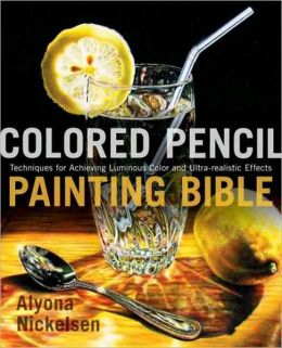
colored pencil painting bible front

Colored Pencil Painting Bible Review

My Colored Pencil Painting Bible review.

colored pencil painting bible review

The book that I’m reviewing today is Colored Pencil Painting Bible: Techniques for Achieving Luminous Color and Ultra-realistic Effects by Alyona Nickelsen. The first thing that I noticed about the book was the cover (duh). That’s a pretty great colored pencil drawing (or painting as the author calls them). The basic technique used throughout the book is essentially layering color with wax based colored pencils (Prismacolor pencils), using solvent (such as Gamblin’s OMS Gamsol) to remove visible pencil strokes and blend the colors together, and finally layering more colored pencil (burnishing where needed) to complete the “painting”.

In the Colored Pencil Painting Bible, Alyona talks about different types of paper, pencils, solvents, and other things such as erasing tools. She tells the reader about color charts and how the reader can create them. This book briefly covers art fundamentals such as composition, color, value, light, and shadows. The author also talks about different pencil strokes, blending, layering colors, burnishing, and image transferring.

At the end of the Colored Pencil Painting Bible the author includes charts that list the lightfastness (how permanent or unaffected by light the color is) of colored pencils. The information can be useful to artists who use colored pencils such as Caran d’Ache Luminance, or Faber-Castell Polychromos. The majority of artists that I know (including myself) who use colored pencils prefer Prismacolor Premier pencils. The charts have no lightfastness ratings for those pencils, which was a huge letdown for me. Thankfully for you, I took the initiative to find the lightfast ratings for the Prismacolor Premier colored pencils. You can see that chart here.

One nice tip I took away from this book is how to obtain a rich black color. Alyona applies black colored pencil to the paper (she prefers Stonehenge), and melts the wax with an OMS wash. Next, she layers indigo blue, dark green, and tuscan red. She then adds another layer of black and blends the mix with a colorless blender.

While I think that Alyona’s technique is nice, I think that the book could be shorter and have a smaller price tag (although as I write this review the book is only $17.15 on Amazon). I think that it has too many exercises in it that just bulk it up. This book provides a good foundation for anyone interested in furthering their knowledge of colored pencils, or anyone who is interested in taking colored pencil art seriously. I recommend at least checking it out from the library if you are serious about colored pencil art.

There you have it! That’s my Colored Pencil Painting Bible review.