Peter Portrait Painting Process

Here’s a look at the portrait painting process for my painting of Peter (my brother). This is painted in oils and it was my first assignment for my Alla Prima class last semester. Sorry for the less-than-stellar photos (a couple of them were taken with a cell phone).

This was a very new technique to me at the time and I was very reluctant to make heavy painterly marks. I began the painting by laying down thinned down washes of color. The shadows in the painting were left fairly thin and the highlights are the thickest opaque spots of paint. I believe that John Singer Sargent painted the same way. This was also my first time painting on canvas boardPortrait Painting Process

Waterfall Speed Painting

I’m still very new at digitally painting, and using a drawing tablet still feels foreign to me. However, I have been practicing. Here’s a recent speed painting of a waterfall. I don’t remember how long it took as I have no sense of time when doing anything art related (besides deadlines). I’m guessing that it was about 10 minutes? I’m looking forward to the great deal of progress ahead of me in the digital realm.

Waterfall Speed Painting

Macbeth

Macbeth Painting Process

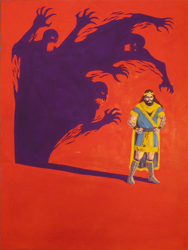
Let’s take a look at the process for my Macbeth painting.

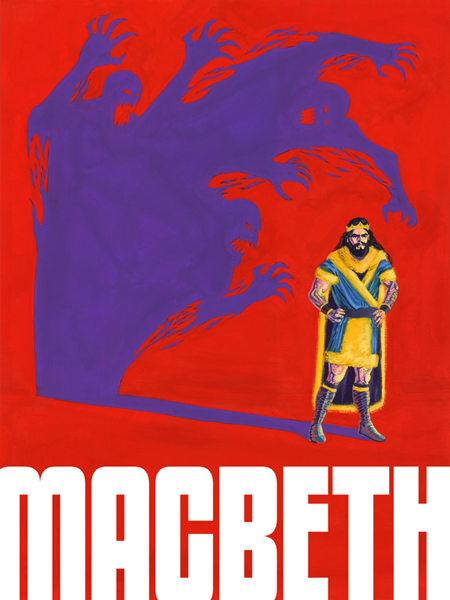
Macbeth

Last year I had to paint a poster for a play or a musical (some type of theatre). My limitations were that I had to use only 4 colors, with the addition of black and white. I chose to paint a poster for the play Macbeth. I thought that I’d give painting with gouache another chance since I had pretty much abandoned it since my color theory class a few years ago.

The four colors I used were Flame Red (Holbein), Permanent Yellow Deep (Holbein), Iris (Holbein), and Primary Blue (Winsor & Newton). In addition to those four colors I was allowed to use white and black. I used Permanent White (Winsor & Newton) and Jet Black (Winsor & Newton).

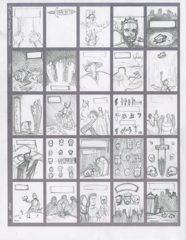
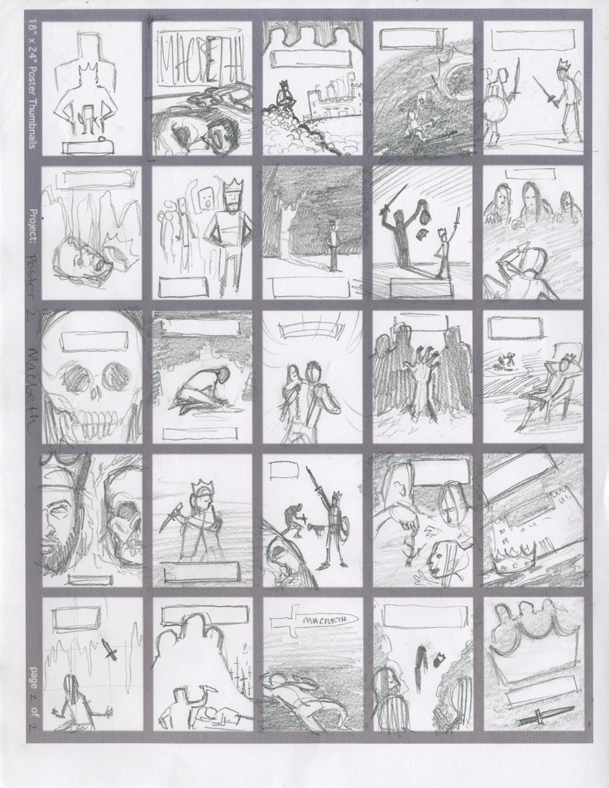
You can see the thumbnail sketches I did below:

Thumbnails

Thumbnails

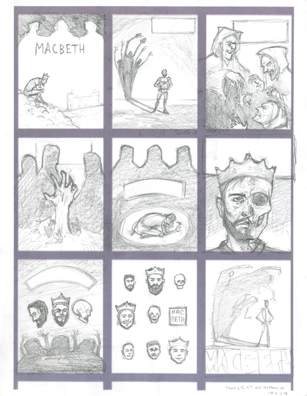
I then picked out my nine favorite thumbnail sketches and drew slightly larger refined thumbnails of those nine sketches. The nine refined thumbnails can be seen below:
Refined Thumbnails

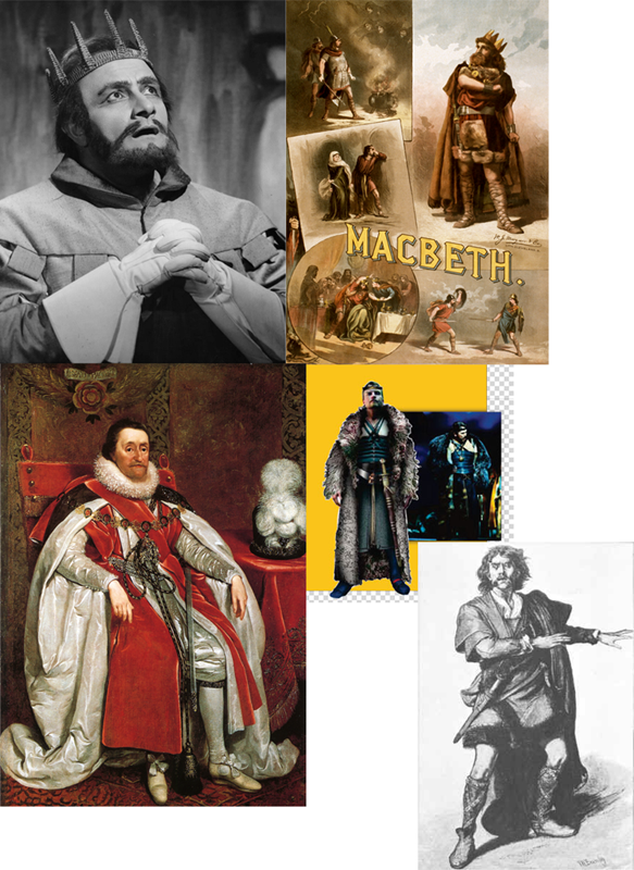
I decided that I liked the bottom right corner thumbnail the most. I gathered some reference photos of Macbeth characters from on the internet.
References

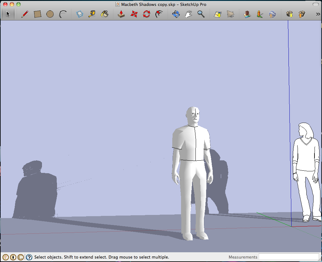
I found a Sketchup model of a person and set up lighting to find the direction of the cast shadow. I’d like to use Sketchup more in the future.
Sketchup Reference

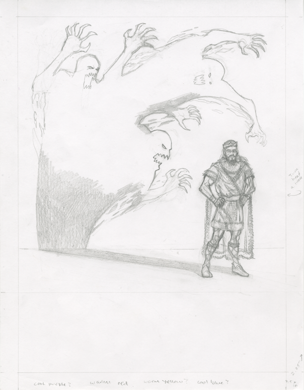
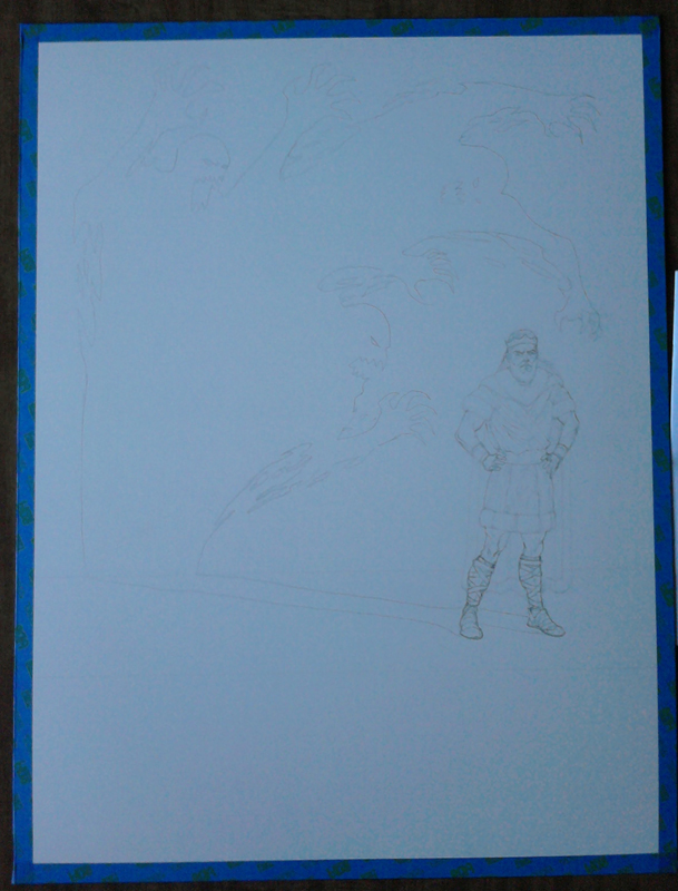
It was time to do the pencil drawing, which once completed, I projected onto illustration board and refined the drawing even further.
Macbeth Pencils

After the pencilled image was drawn I needed to decide what colors to use for the painting. I printed two reduced 3″ x 4″ images of my pencilled drawing and taped them to some cardboard with painters tape. Below are the two color studies I did:

Color Study Color Study

After the color studies were finished I proceeded with the painting.

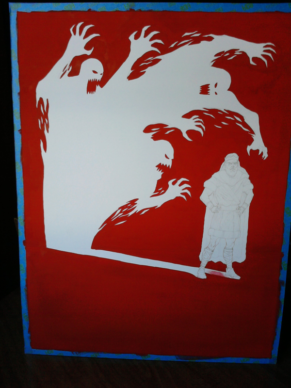
Pencils on Board

Red Background

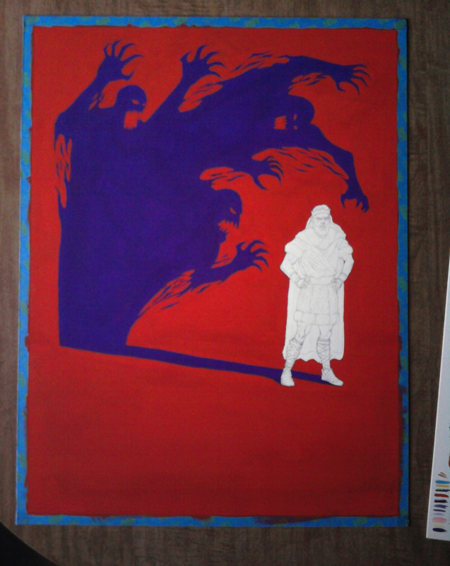
Purple Shadow

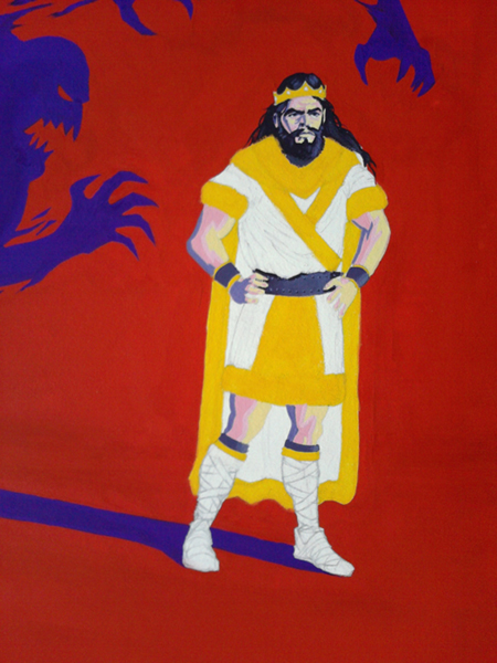
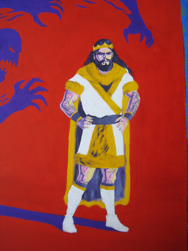
The trickiest part of the painting (besides maintaining a consistent viscosity of paint) was painting Macbeth’s flesh without mixing the colors together. Although I could use four colors plus black and white, I could not mixed the colors together (except with black and white). For example, I could not mix red and yellow together to make a nice orangey flesh color. I had to use red plus white and/or black, yellow plus white and/or black, without overlapping.

Painting the Clothing

Process

Clothing Detail Process

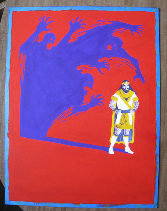
Almost Done

After the painting was completed I scanned it into the computer for the usual color correcting and removal of dust from the scanned images. My teacher recommended that I make the shadow a little lighter and I thought the painting looked better that way as well. I lightened the shadow a little bit and then I added the text.


If you don’t know the story of Macbeth, I highly recommend reading it. It’s a great story and although I read it years ago, it still resonates in my mind.

The Christmas Ornament Painting Process

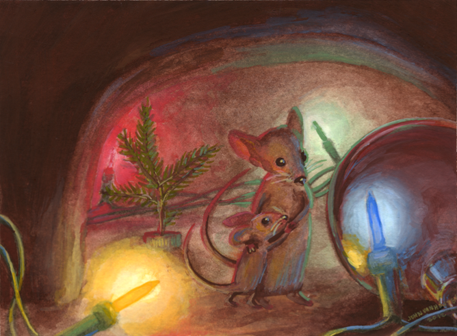
Here are the steps that I took for my painting The Christmas Ornament for the Non-Christmas Show at Fountain Street Church.

The Christmas Ornament

The Christmas Ornament is watercolor and gouache on cold press watercolor paper. 7.25″ x 5.25″. The show ran from November 28, 2012 through January 4, 2013.

The “rules” of the show were simple; we had to use an animal allegory that somehow related to Christmas and a few neon colors here and there would be nice as well.

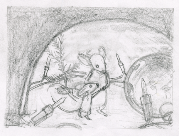
With that information I did a few thumbnail drawings (normally I do many many more thumbnails) and when I picked the composition and idea that I liked the most, I did a larger pencil preliminary of the image. I took many reference photos of a scene I set up using a christmas ornament, christmas lights, a “mini-christmas tree” aka a clipping from a pine tree, attached to a pop bottle top using a paperclip (the mice would have put this together), and some of my mother’s collectible mice figurines. After that, I looked for some reference pictures of mice. I projected my drawing onto the paper; drew a faint outline with pencil and taped the paper to a piece of wood with painters tape. I applied some thin washes of watercolor and the paper began to bow. I then sought out a different method of keeping it flat.

The watercolor paper I used wasn’t very thick and it buckled quickly so I decided to use the ‘popsicle method‘ found on HandPrint to stretch my paper. I don’t have any popsicle sticks so I used a wooden paint stir stick. I cut it on the band saw into smaller pieces. If you want to know more about this method of stretching paper (which I recommend you learn how to do) go here.

This painting was originally going to be just a watercolor painting but I decided that it needed the brightness you can achieve using gouache. Boy, am I glad I decided to add gouache to the painting!  It immediately started to ‘pop’ after I added gouache. I even tried mixing watercolor paint with white gouache (which is not that uncommon).

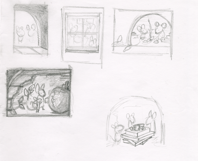
Thumbnail Sketches

These are the thumbnail sketches for the painting. The idea I decided to use was two mice, a father or mother mouse, with their child mouse, enjoying each others company and looking at the christmas ornament (hence the name of the painting). We are peeking in at them through a hole in the wall. They made a christmas tree using part of a branch and a pop bottle cap and a paperclip. They dragged some of the christmas lights from in the room into their home.

Pencil Preliminary

The pencil preliminary measures 5.5″x4″.

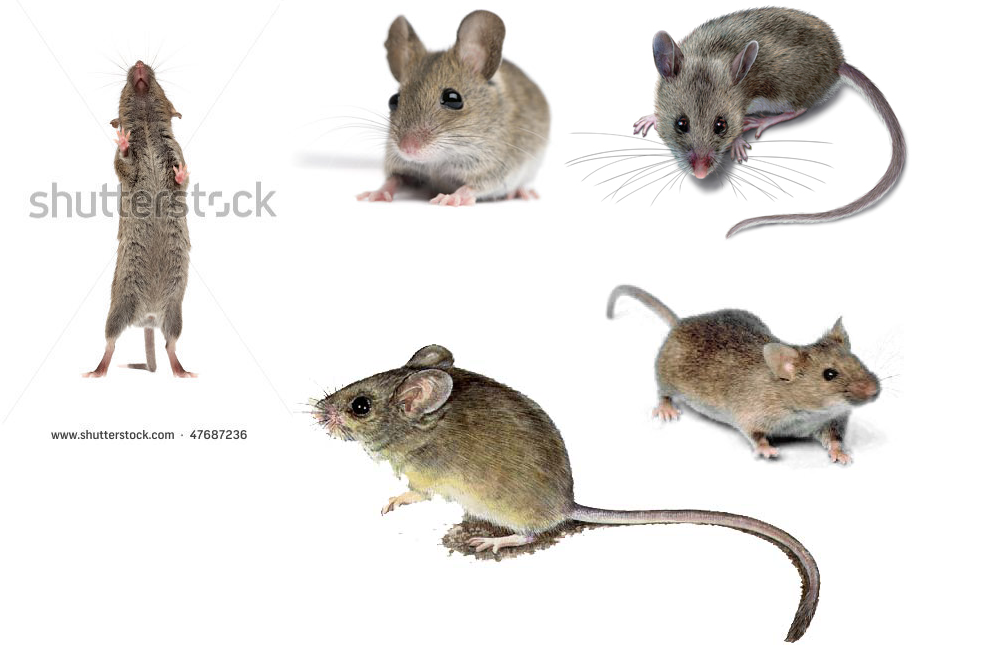
Mice Reference

Mice reference photos.

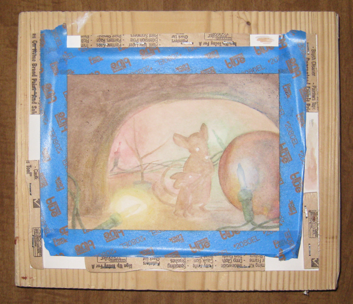
Process 1

The Christmas Ornament early in the early painting stages. Here you can see the paint stir sticks I used to stretch the paper.

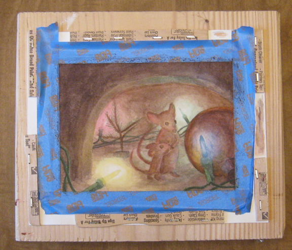
Process 2

The Christmas Ornament later in the painting stages. Note how flat the colors are at this stage. I believe I had not added gouache to the painting yet. The gouache really darkened the darks and lightened the lights.

If you are interested in purchasing this painting, please contact me. I’d love to do business with you.

Monoprice Tablet Unboxing

Today we are going to be unboxing the Monoprice Tablet (specifically the 10 x 6.25 Inch Graphic Drawing Tablet)!

I bought the Monoprice 10X6.25 Inches Graphic Drawing Tablet on Amazon. You can purchase it directly from Monoprice’s website but the cost of shipping is what kills the deal (although this tablet is still quite a steal).

This post isn’t my review of the tablet, but the unboxing photos, because some people are into that. Keep an eye out for my review in the near future.


Tablet PackageI ordered my tablet from Amazon and when the package arrived I had no idea what I received. That’s mostly due to the package being enormous.

Tablet Package Size ComparisonHere is a size comparison with an iPod Classic just to show you how oversized this package is.

Inside the Tablet PackageAnd now we take a peek into the package. Initially there was paper in here to somehow protect the box from moving around (or just to take up space). I took that out before snapping a photo.

Monoprice TabletHere’s the front of the box. It’s nothing special but it could be uglier. I wasn’t expecting the elegant design of a Zune box or something from Apple.

Monoprice TabletHere’s the back of the box. It mentions some stupid free tablet software that I will never use.

Monoprice TabletSome words and such on the back of the box.

Monoprice TabletThe contents of the box. The tablet, the pen, the software/manual, extra nibs, a battery and the pen holder.

Monoprice TabletHere’s the tablet in all of it’s glory! No, it doesn’t have a weird white spot on the surface, that’s just the reflection from the flash on the camera.

Monoprice TabletCloseup of the tablet shortcut keys. These are changeable in the software.

Monoprice TabletHere’s the tablet surface overlay. It lifts up so you can put a photo underneath and trace it? Something along those lines.

Monoprice TabletThe bottom of the tablet!

Monoprice TabletThis gizmo holds the pen.

Monoprice TabletThe bottom of the pen holder has a contraption on it for removing nibs.

Monoprice PenThis is the pen. It may not look like much but it works. I’d say that the number one negative thing I see in reviews for this tablet is about the pen. More about that in my review to come.

Monoprice NibCloseup of the nib in the pen.

Monoprice Pen ButtonsThe buttons on the pen. They default as primary and secondary clicks.

Monoprice TabletThe battery, nibs, software, and manual.

Monoprice TabletSize comparison of the tablet with my 2009 15.4″ Unibody MacBook Pro.

Burglary?On the protective bag around the tablet there was a mysterious graphic showing what I interpret as Monoprice despising burglars. Either that or you’re supposed to keep the bag away from infants.


Did you figure out what my favorite package design was from?

What product do you think has the best package design?