Speed Paintings Circa Early 2013: Part One

Today you get the pleasure of seeing 5 digital speed paintings I made in early 2013 (and an animated GIF of one of the speed paintings, showing the different layers!). I had just gotten a drawing tablet so it was a big learning experience. I’m still not completely comfortable digitally painting but I’m much better now than I was then (of course). All of the digital speed paintings were made in Adobe Photoshop CS5.

Keep your eyes peeled for part two, featuring 5 more digital speed paintings from early 2013! This also marks the first time I split up a blog post into 2 parts! Everybody celebrate! Also on the topic of digital painting, I will have my long awaited review of the Monoprice Tablet ready in the very near future (meaning that I actually started writing it and I just need to revise it).

Desert Oasis Speed Painting

Grassy Hills Speed Painting

Grassy-Hills-Speed-Painting-Animated

Animated GIF showing the different layers of this speed painting

Marsh Speed Painting

Space Speed Painting

And my favorite of the batch (perfect for Halloween because it’s spooky):

Spooky Forest Speed PaintingAs always, I love to hear your questions or comments (if you’re not too busy preparing your Halloween costume).

Surtur Rising Process

It’s been a while since I’ve shown some process shots of my art so let’s take a look at an older gouache painting. The painting assignment restricted my palette to just black and white.

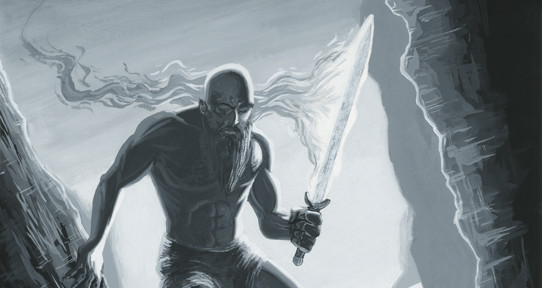
Here’s the painting:

Surtur Rising
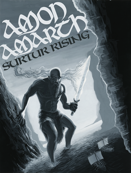
Now you may be asking yourself “who or what is Surtur?” or “what the heck is Amon Amarth?”

Surtur (also known as Surtr) is a jötunn (aka a giant) from Norse mythology (aka Scandinavian mythology). He also has a fiery sword. That’s pretty much all you need to know. Amon Amarth is a band that doesn’t like to be labelled “viking metal”. They sing (or growl or whatever you want to call it) about vikings. They have viking themed albums. They love norse mythology. Whatever. They are a melodic death metal band. One of their albums is Surtur Rising.

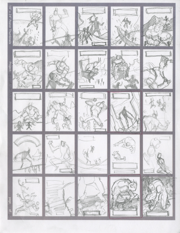
Now onto the process:

Instead of doing a grisly and dark illustration that is typically associated with bands like Amon Amarth, I decided to do a “comicy” style illustration. Side note: this painting is probably the first gouache painting I did since I took the color theory class years ago.

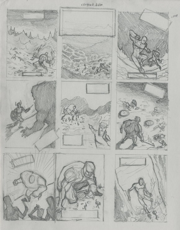
To begin, here are the 50 thumbnails I did prior to deciding on a composition (each thumbnail is about 1.375″ x 1.875″). Because the illustration was going to be a poster I had to also think about text placement when designing my composition.

Surtur Rising Thumbnails 1Surtur Rising Thumbnails 2 
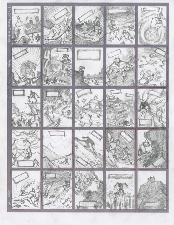
Sometimes I’m kind of undecided about things, maybe (see what I did there?). I chose some thumbnails that I especially liked from the 50 above and drew some larger refined thumbnail drawings. Each thumbnail is 2.25″ x 3″. I drew them on gray paper because I had some gray paper left over from when I operated an offset printer in high school and I figured “why not?” (don’t answer that).

Surtur Rising Refined Thumbnails

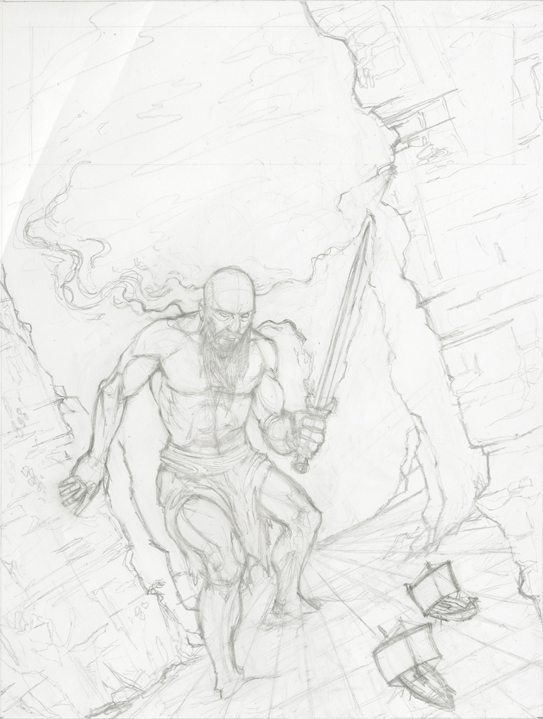
I decided on the design and composition and drew up a larger drawing for the “pencils” stage. Not pictured are the reference photos I took for this illustration. The final pencil drawing is 7.5″ x 10″ (by the way, pretty much all of my art is for sale. If you want some original art, all you need to do is contact me). The pencil drawing is drawn on some horrible shiny paper. I don’t even know why this paper was manufactured. It’s very difficult to make revisions to the drawing because of the slick surface of the paper (also included are creases that I accidentally added to the paper).

Surtur Rising Pencils
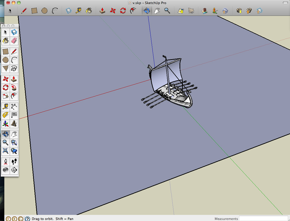
To figure out how the ships would look I downloaded a Google SketchUp model and used that as reference. When I made this painting I hated SketchUp. That’s mainly because I was only using the trackpad on my laptop instead of a mouse. Tip for anyone using SketchUp: use a mouse (the computer peripheral not the rodent).

Surtur Rising Sketchup

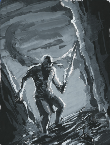
Next up I painted a value study for the painting. I find these to be more fun than the actual painting and often times I like them more than the final painting. They have a lot of energy and painterly marks. I scanned the drawing and printed it out on my B&W laser printer. I glued it to cardboard (probably the back of an oatmeal box because I recycle [you should recycle too]). This value study is 6″ x 8″.

Surtur Rising Value Study

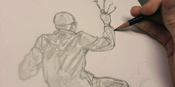
I only remembered to take a couple of photos of the illustration in progress.

Surtur Rising Pencils on Board 
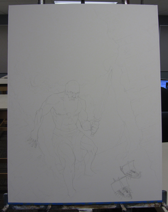
The pencil drawing is transferred to the illustration board.

Surtur Rising Almost Finished
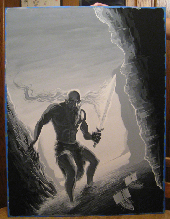
The painting is almost finished.

Surtur Rising No Text
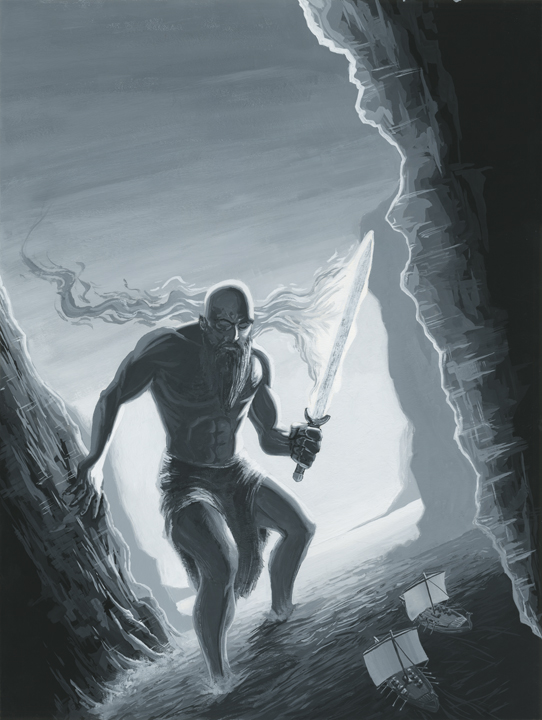
And the painting before text was added.

And that’s it for this episode of my creative process. What do you think? Feel free to leave a comment. Speaking of comments: It has come to my attention that some of the older less-computer-literate readers don’t know how to leave comments. If you are reading my blog on my homepage then you just simply click the gray word bubble next to the title of the blog post (see image below).

How to comment

If you have clicked on the blog post title, or you are only seeing one blog post with no other posts on the page then you can probably just scroll down the page and you should see a comment box. Congratulations! You now know how to comment! If you want more John VanHouten in your life between blog posts you can follow me on Twitter.
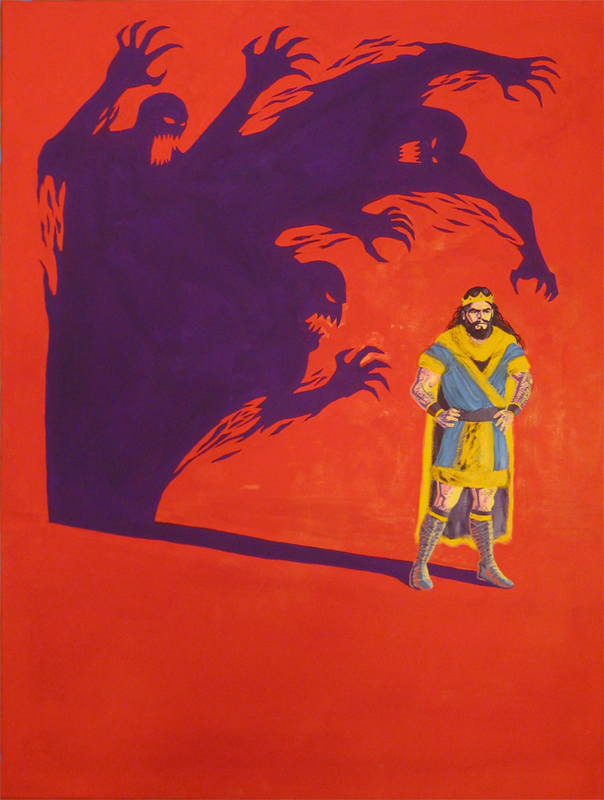
Creepy Dentist Sketch

Here’s a sneak peak of me sketching a creepy dentist for an upcoming digital painting. Look at all of those tools in his evil teeth-cleaning hand (do you recognize any of those tools?). I posted this on Twitter (I encourage you to follow me on Twitter if you like art, or just crazy shenanigans–but mostly art) first but in case you missed it, here it is:

Creepy Dentist Sketch


And yes, that’s how I hold my pencil. I never said I was normal.

Elmer's Carpenter's Wood Glue Max

Elmer’s Carpenter’s Wood Glue Max Strength Test

Elmer's Carpenter's Wood Glue Max

Because I need strong wood glue to keep a painting attached to the wood braces.

Lately I have been doing a lot of prep work for future paintings. I also am looking into wood bracing (often referred to as cradling) for two finished paintings (which, now that I think about it, aren’t even on my website yet). After searching through dozens of threads on WetCanvas and AMIEN, I still wasn’t exactly sure what type of glue to use to attach the bracing to the back of the paintings but I knew that I wanted the bracing to be strong. After reading about some strength tests with several types of glues, I made a not-so-quick trip to Lowe’s and I purchased Elmer’s Carpenter’s Wood Glue Max (they also offer a non “max” wood glue). For the test I used 3/16″ hardboard (often mistakenly referred to as Masonite) and 1″ x 2″ select pine wood for the bracing. I used the Wood Glue Max to glue the select pine to the hardboard. The glue was allowed to dry for 24 hours (although this test was actually done several days after gluing).

Here’s a video of my testing the strength of the glue:

As you can see, the glue held a strong bond and the wood broke instead of the glue. I will definitely be using this wood glue in the future, and no, I’m not being paid by Elmer’s to praise their product.


Peter Portrait Painting Process

Here’s a look at the portrait painting process for my painting of Peter (my brother). This is painted in oils and it was my first assignment for my Alla Prima class last semester. Sorry for the less-than-stellar photos (a couple of them were taken with a cell phone).

This was a very new technique to me at the time and I was very reluctant to make heavy painterly marks. I began the painting by laying down thinned down washes of color. The shadows in the painting were left fairly thin and the highlights are the thickest opaque spots of paint. I believe that John Singer Sargent painted the same way. This was also my first time painting on canvas boardPortrait Painting Process

Macbeth

Macbeth Painting Process

Let’s take a look at the process for my Macbeth painting.

Macbeth

Last year I had to paint a poster for a play or a musical (some type of theatre). My limitations were that I had to use only 4 colors, with the addition of black and white. I chose to paint a poster for the play Macbeth. I thought that I’d give painting with gouache another chance since I had pretty much abandoned it since my color theory class a few years ago.

The four colors I used were Flame Red (Holbein), Permanent Yellow Deep (Holbein), Iris (Holbein), and Primary Blue (Winsor & Newton). In addition to those four colors I was allowed to use white and black. I used Permanent White (Winsor & Newton) and Jet Black (Winsor & Newton).

You can see the thumbnail sketches I did below:

Thumbnails

Thumbnails

I then picked out my nine favorite thumbnail sketches and drew slightly larger refined thumbnails of those nine sketches. The nine refined thumbnails can be seen below:
Refined Thumbnails

I decided that I liked the bottom right corner thumbnail the most. I gathered some reference photos of Macbeth characters from on the internet.
References

I found a Sketchup model of a person and set up lighting to find the direction of the cast shadow. I’d like to use Sketchup more in the future.
Sketchup Reference

It was time to do the pencil drawing, which once completed, I projected onto illustration board and refined the drawing even further.
Macbeth Pencils

After the pencilled image was drawn I needed to decide what colors to use for the painting. I printed two reduced 3″ x 4″ images of my pencilled drawing and taped them to some cardboard with painters tape. Below are the two color studies I did:

Color Study Color Study

After the color studies were finished I proceeded with the painting.

Pencils on Board

Red Background

Purple Shadow

The trickiest part of the painting (besides maintaining a consistent viscosity of paint) was painting Macbeth’s flesh without mixing the colors together. Although I could use four colors plus black and white, I could not mixed the colors together (except with black and white). For example, I could not mix red and yellow together to make a nice orangey flesh color. I had to use red plus white and/or black, yellow plus white and/or black, without overlapping.

Painting the Clothing

Process

Clothing Detail Process

Almost Done

After the painting was completed I scanned it into the computer for the usual color correcting and removal of dust from the scanned images. My teacher recommended that I make the shadow a little lighter and I thought the painting looked better that way as well. I lightened the shadow a little bit and then I added the text.


If you don’t know the story of Macbeth, I highly recommend reading it. It’s a great story and although I read it years ago, it still resonates in my mind.

The Christmas Ornament Painting Process

Here are the steps that I took for my painting The Christmas Ornament for the Non-Christmas Show at Fountain Street Church.

The Christmas Ornament

The Christmas Ornament is watercolor and gouache on cold press watercolor paper. 7.25″ x 5.25″. The show ran from November 28, 2012 through January 4, 2013.

The “rules” of the show were simple; we had to use an animal allegory that somehow related to Christmas and a few neon colors here and there would be nice as well.

With that information I did a few thumbnail drawings (normally I do many many more thumbnails) and when I picked the composition and idea that I liked the most, I did a larger pencil preliminary of the image. I took many reference photos of a scene I set up using a christmas ornament, christmas lights, a “mini-christmas tree” aka a clipping from a pine tree, attached to a pop bottle top using a paperclip (the mice would have put this together), and some of my mother’s collectible mice figurines. After that, I looked for some reference pictures of mice. I projected my drawing onto the paper; drew a faint outline with pencil and taped the paper to a piece of wood with painters tape. I applied some thin washes of watercolor and the paper began to bow. I then sought out a different method of keeping it flat.

The watercolor paper I used wasn’t very thick and it buckled quickly so I decided to use the ‘popsicle method‘ found on HandPrint to stretch my paper. I don’t have any popsicle sticks so I used a wooden paint stir stick. I cut it on the band saw into smaller pieces. If you want to know more about this method of stretching paper (which I recommend you learn how to do) go here.

This painting was originally going to be just a watercolor painting but I decided that it needed the brightness you can achieve using gouache. Boy, am I glad I decided to add gouache to the painting!  It immediately started to ‘pop’ after I added gouache. I even tried mixing watercolor paint with white gouache (which is not that uncommon).

Thumbnail Sketches

These are the thumbnail sketches for the painting. The idea I decided to use was two mice, a father or mother mouse, with their child mouse, enjoying each others company and looking at the christmas ornament (hence the name of the painting). We are peeking in at them through a hole in the wall. They made a christmas tree using part of a branch and a pop bottle cap and a paperclip. They dragged some of the christmas lights from in the room into their home.

Pencil Preliminary

The pencil preliminary measures 5.5″x4″.

Mice Reference

Mice reference photos.

Process 1

The Christmas Ornament early in the early painting stages. Here you can see the paint stir sticks I used to stretch the paper.

Process 2

The Christmas Ornament later in the painting stages. Note how flat the colors are at this stage. I believe I had not added gouache to the painting yet. The gouache really darkened the darks and lightened the lights.

If you are interested in purchasing this painting, please contact me. I’d love to do business with you.